Lamp
Display color that reflects signal value on lamp with customizable appearance
Since R2021b
Libraries:
Simulink /
Dashboard /
Customizable Blocks
Description
The Lamp block displays a color that reflects the value of the connected signal. When you use the Lamp block in the Customizable Blocks library, you can modify the appearance of the block so it looks like a real indicator lamp in your system. Use the Lamp block with other dashboard blocks to build an interactive dashboard of controls and indicators for your model.
To configure the Lamp block, specify one or more states. A state pairs a state value with a color for the Lamp block to display. When the value of the connected signal is the same as the state value, the Lamp block displays the color. You can also specify the state value as a range, such that the block displays the color when the value of the connected signal falls into the specified range.
Customize Lamp Blocks
When you add a Lamp block to your model, the block is preconfigured with a default design. You can use the block with the default design or customize the appearance of the block.
To customize the appearance of the block, use design mode. After selecting the block, you can enter design mode in one of three ways:
In the Simulink® Toolstrip, on the block-specific tab, under Design, click Edit.
In the Property Inspector, on the Design tab, click Edit.
Pause on the ellipsis that appears over the block and click the Edit Custom Block button
 .
.
In design mode, you can use the toolbar above the block to customize the lamp. To access additional customization options or to enter exact values for design settings, use the Design tab in the Property Inspector.
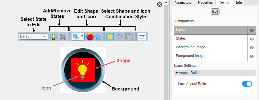
When you customize a Lamp block, you configure the block appearance for
each state. To select a state to customize, use the drop-down list in the toolbar.
Alternatively, on the Design tab, select the
States component, and then select from the Select
State list. To add a state, in the toolbar, click the Add State button
 . To delete a state, click the Remove State button
 .
.
Design Mode Actions that Customize the Selected State
| Action | Available in Toolbar | Available in Design Tab |
|---|---|---|
Specify the state value as a number or a range. | No | Yes |
| Add or remove states. | Yes | Yes |
Select a shape for the region whose color reflects the signal value. | Yes | Yes |
Select the color of the shape. | Yes | Yes |
Select from an icon set that includes wireless icons and automotive indicator lamps, or upload a custom icon. | Yes | Yes |
Specify how to combine the shape and the icon. | Yes | Yes |
| Change the size of the shape and icon. | No | Yes |
| Change the position of the shape and icon. | No | Yes |
In addition to customizing the block design using the toolbar and Design tab, you can also resize and reposition components interactively in the canvas. To resize a component specific to a state, such as the icon, select the state in the toolbar, and then resize or reposition the component.
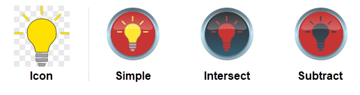
To combine the shape and icon, in the third section of the toolbar from the left, choose one of these combination styles:
Simple — Overlay the icon on top of the shape.
Intersect — Retain the intersection of the shape and icon as the area whose color reflects the signal value.
Subtract — Retain the shape with the icon cut out of it as the area that changes color.
Tip
The intersect and subtract combination styles use transparency in the icon asset to produce the area that changes color. For custom icons, consider using image formats that support transparency, such as SVG or PNG.
Design Mode Actions that Apply to All States
| Action | Available in Toolbar | Available in Design Tab |
|---|---|---|
Upload a background image. | No | Yes |
Set a solid background color. | No | Yes |
Upload a foreground image. | No | Yes |
When you finish editing the design, to exit design mode, click the X in the upper right of the canvas.
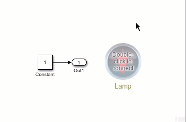
Connect Dashboard Blocks
Dashboard blocks do not use ports to connect to model elements. To connect a dashboard block,
use connect mode. To enter connect mode on an unconnected block, pause on the block you want
to connect and click the Connect button  . To enter connect mode on a connected block, select the
block, pause on the ellipsis that appears (…), and in the action menu that expands, click
the Connect button.
. To enter connect mode on a connected block, select the
block, pause on the ellipsis that appears (…), and in the action menu that expands, click
the Connect button.
To connect a display block to a signal in your model or change the connection of a display
block, enter connect mode. Select the signal line to which you want to connect. From the
list that appears, select the signal to which you want to connect. Then, pause on the
dashboard block and click the Done Connecting button . To see the dashboard block display the value of the
connected block, run the simulation.
For more information about connecting dashboard blocks, see Connect Dashboard Blocks to Simulink Model.
You can also connect dashboard blocks to a Stateflow® chart. For more information, see Connect Dashboard Blocks to Stateflow (Stateflow).
This animation shows how to connect the Lamp block to your model.
Examples
Design Custom Lamps
Design lamps using the customizable Lamp block.
Limitations
Except for the Dashboard Scope block and the Display block, dashboard blocks can only connect to real scalar signals.
You cannot use the Connection table in the Block Parameters dialog box to connect a dashboard block to a block that is commented out. When you connect a dashboard block to a commented block using connect mode, the dashboard block does not display the connected value until the you uncomment the block.
Dashboard blocks cannot connect to model elements inside referenced models.
When you simulate a model hierarchy, dashboard blocks inside referenced models do not update.
Dashboard blocks do not support rapid accelerator simulation.
During simulation, you cannot connect a dashboard block to Stateflow chart data or state activity.
You cannot programmatically connect a dashboard block to Stateflow chart data or state activity.
Some signals do not have data available during simulation due to block reduction or optimization for accelerator mode simulations. To view such a signal using a dashboard block, mark the signal for logging.
Parameters
Use the Property Inspector and the Block Parameters dialog box to specify the values of the block parameters. To set the core parameters of the dashboard block, use the Block Parameters dialog box or the Parameters tab in the Property Inspector. To customize the block, use the Design tab in the Property Inspector. To open the Block Parameters dialog box for a block, double-click the block. To open the Property Inspector, on the Modeling tab, under Design, select Property Inspector.
Parameters Tab of Property Inspector
To set the core parameters of the dashboard block, open the Property Inspector and click the Parameters tab.
Signal
This block is a display block — a block that displays a signal value. Connect the block to the signal you want to display.
Dashboard blocks do not use ports to connect to model elements. To connect a dashboard block, use connect mode, the Simulink Toolstrip, or the Connection table in the Block Parameters dialog box. For information, see Connect Dashboard Blocks to Simulink Model.
To connect to a signal using Connection table:
Select the block.
In the Property Inspector, on the Parameters tab, click Connect or Change.
Select the signal line to whose signal you want to connect.
In the table that appears, select the signal.
Click Apply.
You can also connect dashboard blocks to a Stateflow chart. For more information, see Connect Dashboard Blocks to Stateflow (Stateflow).
Programmatic Use
You can programmatically connect a display block to a signal. Define a Simulink.HMI.SignalSpecification
object that represents the signal. Then, set the value of the
Binding parameter to the object. To set the value of the
Binding parameter, use the set_param function.
For example, suppose the model named vdp contains a
Circular Gauge block named myGauge and a
signal named x1. To connect the block to the signal, use this
code.
blockPath = "vdp/myGauge";
signalPath = "vdp/x1";

myObj = Simulink.HMI.SignalSpecification;
myObj.BlockPath = Simulink.BlockPath(signalPath);

set_param(blockPath,Binding=myObj)
| Parameter: | Binding |
| Values: | Simulink.HMI.SignalSpecification object |
Example: set_param(gcb,Binding=myObj)
Main
You can display the name of the element to which the dashboard block connects in a
label positioned at the top or bottom of the block, or you can hide the label. If you
want the label to be visible, specify the position of the label. If you do not want the
label to be visible, select Hide.
Note
When the dashboard block is not connected to an element, the label is blank.
Programmatic Use
To set the block parameter value programmatically, use
the set_param function.
| Parameter: | LabelPosition |
| Values: | 'Hide' (default) | "Hide" | "Bottom" | "Top" |
Example: set_param(gcb,LabelPosition="Top")
Select this parameter to maintain the aspect ratio when resizing the block in the Simulink canvas.
When the aspect ratio is locked, adding a new background image changes the aspect ratio of the block to match the aspect ratio of the background image. When the aspect ratio is unlocked, adding a new background image does not change the aspect ratio of the block, but instead changes the aspect ratio of the background image to fit the size of the block.
When the aspect ratio is locked, pressing the Shift key while resizing a block temporarily unlocks the aspect ratio. When you release the Shift key, the aspect ratio locks. When the aspect ratio is unlocked, pressing the Shift key while resizing a block temporarily locks the aspect ratio. When you release the Shift key, the aspect ratio unlocks.
States
You can specify ranges of signal values that activate the states. Select Specify State Values as Ranges and specify the minimum and maximum of the value range that activates each state.
Programmatic Use
To set the block parameter value programmatically, use
the set_param function.
| Parameter: | StateValueType |
| Values: | 'Discrete' (default) | "Discrete" | "Range" |
Example: set_param(gcb,StateValueType="Range")
States pair a lamp color with a value of the connected signal. Each state consists of a Value and a Color.
Value — Connected signal value or range of signal values that cause the Lamp block to display the specified color. To specify a range of values, select Specify State Values as Ranges and specify the minimum and maximum of the range of values that activates each state.
Color — Lamp color when the connected signal value matches the corresponding State value. You can select from a palette of standard colors or specify a custom color with
RGBvalues.
The [undefined] state specifies the color of the
Lamp block when the connected signal value does not match any of the
values specified in the States table. Click the
+ button to add another state.
Programmatic Use
To set the block parameter value programmatically, use
the set_param function.
Specify the value of the StateColors parameter as an array of
structures, where each structure represents a state. Each structure contains these
fields:
Value— Signal value, specified as a scalar when Specify State Values as Ranges is turned off, and as a vector of the form[min max]when Specify State Values as Ranges is turned on, whereminandmaxare the minimum and maximum values of the rangeColor— Color the Lamp block displays when the connected signal has that value, specified as an[r g b]vector
For example, suppose you want the currently selected Lamp block
to have two states. In the first state, when the connected signal has a value of
0, the block displays the color blue. In the second state, when
the connected signal has a value of 2, the block displays the
color red. To implement these states, use this code.
state1.Value = 1;
state1.Color = [0 0 1];
state2.Value = 2;
state2.Color = [1 0 0];
myStates = [state1 state2];

set_param(gcb,StateColors=myStates)
Now suppose you want the block to have the same two states, except that in the
first state, the connected signal has a value between -10 and
0, and in the second state, the connected signal has a value
between 0 and 20. To implement these states,
use this code.
set_param(gcb,StateValueType="Range")

state1.Value = [-10 0];
state1.Color = [0 0 1];
state2.Value = [0 20];
state2.Color = [1 0 0];
myStates = [state1 state2];

set_param(gcb,StateColors=myStates)| Parameter: | StateColors |
| Values: | N-by-1 struct array, where
N is the number of states and each struct has the fields
Value and Color |
Example: set_param(gcb,StateColors=myStates)
The ColorDefault parameter specifies the color for the
Lamp block when the value of the connected signal does not match
any of the specified state values.
| Parameter: | ColorDefault |
| Values: | [0.7529 0.7529 0.7529] (default) | [r g b] vector with values between 0
and 1 |
Example: set_param(gcb,ColorDefault=[1 0 1])
Design Tab of Property Inspector
To customize the dashboard block, open the Property Inspector, click the Design tab, and click Edit.
Lamp
Select this parameter to maintain the aspect ratio when resizing the block in the Simulink canvas.
When the aspect ratio is locked, adding a new background image changes the aspect ratio of the block to match that of the background image. When the aspect ratio is unlocked, adding a new background image does not change the proportions of the block but instead stretches or scales the background image to fit the size of the block.
When the aspect ratio is locked, pressing the Shift key while resizing a block unlocks the aspect ratio. When you release the Shift key, the aspect ratio locks. When the aspect ratio is unlocked, pressing the Shift key while resizing a block locks the aspect ratio. When you release the Shift key, the aspect ratio unlocks.
States
Select a state that you want to configure from the drop-down menu in the Select State section of the States component. You can use a customizable Lamp block to design a lamp with any number of states greater than or equal to 1. Click + to add another state. Click X to delete the current state.
States match a display color to the value of the connected signal. Each state consists of a State and a Color.
State — Connected signal value or range of signal values that cause the Lamp block to display the specified color. To specify a range of values, select Specify State Values as Ranges and specify the minimum and maximum of the range of values that activates each state.
Color — Lamp color when the connected signal value matches the corresponding State value. You can select from a palette of standard colors or specify a custom color with
RGBvalues.
The [default] state specifies the color of the
Lamp block when the connected signal value does not match any of the
values specified in the States table.
Note
You can configure more than the value and color of a state: you can configure all of the parameters in the States component of the Design tab for a state. For example, you can select an icon that will appear on the lamp when it is in the state. When you configure any of the parameters in the States component, the changes are applied to the state that is selected in the Select State section of the States component.
Tips
You can also configure the values and colors of the states for the block using the Parameters tab in the Property Inspector.
Programmatic Use
To set the block parameter value programmatically, use
the set_param function.
Specify the value of the StateColors parameter as an array of
structures, where each structure represents a state. Each structure contains these
fields:
Value— Signal value, specified as a scalar when Specify State Values as Ranges is turned off, and as a vector of the form[min max]when Specify State Values as Ranges is turned on, whereminandmaxare the minimum and maximum values of the rangeColor— Color the Lamp block displays when the connected signal has that value, specified as an[r g b]vector
For example, suppose you want the currently selected Lamp block
to have two states. In the first state, when the connected signal has a value of
0, the block displays the color blue. In the second state, when
the connected signal has a value of 2, the block displays the
color red. To implement these states, use this code.
state1.Value = 1;
state1.Color = [0 0 1];
state2.Value = 2;
state2.Color = [1 0 0];
myStates = [state1 state2];

set_param(gcb,StateColors=myStates)
Now suppose you want the block to have the same two states, except that in the
first state, the connected signal has a value between -10 and
0, and in the second state, the connected signal has a value
between 0 and 20. To implement these states,
use this code.
set_param(gcb,StateValueType="Range")

state1.Value = [-10 0];
state1.Color = [0 0 1];
state2.Value = [0 20];
state2.Color = [1 0 0];
myStates = [state1 state2];

set_param(gcb,StateColors=myStates)| Parameter: | StateColors |
| Values: | N-by-1 struct array, where
N is the number of states and each struct has the fields
Value and Color |
Example: set_param(gcb,StateColors=myStates)
The ColorDefault parameter specifies the color for the
Lamp block when the value of the connected signal does not match
any of the specified state values.
| Parameter: | ColorDefault |
| Values: | [0.7529 0.7529 0.7529] (default) | [r g b] vector with values between 0
and 1 |
Example: set_param(gcb,ColorDefault=[1 0 1])
Apply the settings of the default state to all other states. This option applies to all settings in the States component except for the settings in the Value and Color section.
You can specify ranges of signal values that activate the states. Select Specify State Values as Ranges and specify the minimum and maximum of the value range that activates each state.
Programmatic Use
To set the block parameter value programmatically, use
the set_param function.
| Parameter: | StateValueType |
| Values: | 'Discrete' (default) | "Discrete" | "Range" |
Example: set_param(gcb,StateValueType="Range")
Each state pairs a Value with a Color. Specify the Value that activates the state selected in the Design tab.
Note
When the Specify State Values as Ranges option is enabled,
the Value parameter changes to the parameters
Minimum and Maximum, which allow you to
define a range by specifying its minimum and maximum values.
Each state pairs a Value with a Color. Choose the Color of the state selected in the Design tab from the palette of standard colors, or specify a custom color.
Example: [1 0 0]
Specify the opacity of the state Color as a scalar value from 0 to 1.
A lamp can show up to three different colors:
State Color
Color of the selected icon in the Property Inspector
Background color or the background image, depending on which is activated
The colors that show on the lamp depend on how the shape and icon layers of the Lamp block are combined. Select how to combine the layers:
In the
Intersectstyle, the area where the shape and icon overlap has the state Color. The area where the shape and icon do not overlap has the background color or image.In the
Simplestyle, the area of the shape that is not covered by the icon has the state Color. The icon on the lamp has the same colors as its counterpart in the Property Inspector. The remaining area has the background color or image.In the
Subtractstyle, the area of the shape that is not covered by the icon has the state Color. The remaining area has the background color or image.
Select a shape that, in combination with the icon, determines the area on the lamp to which the state Color is applied. Choose a circle, a square, or a triangle.
Use an icon to configure the appearance of the Lamp block in the model. You can choose from built-in shape, automotive, and wireless icons, or you can upload your own custom SVG file as an icon.
To view icon options, in the Icon section, select an
Icon Type. To use your own SVG file as the block icon, in the
Icon section, select Custom as the
Icon Type, and in the Custom Icon section,
click the plus button to upload the SVG file.
Shape Icons
| Icon | Icon Name | Programmatic Use Value |
|---|---|---|
|
| Lamp | Default |
|
| Check1 | Check1 |
|
| Check2 | Check2 |
|
| Check3 | Check3 |
|
| Check4 | Check4 |
|
| Circle | Circle |
|
| Ex1 | Ex1 |
|
| Ex2 | Ex2 |
|
| Ex3 | Ex3 |
|
| Ex4 | Ex4 |
|
| Face | Face |
|
| Frown1 | Frown1 |
|
| Frown2 | Frown2 |
|
| Hexagon | Hexagon |
|
| L-shaped Membrane | Membrane |
|
| Pentagon | Pentagon |
|
| Rectangle | Rectangle |
|
| Smile1 | Smile1 |
|
| Smile2 | Smile2 |
|
| Solid Face | SolidFace |
|
| Solid Frown1 | SolidFrown1 |
|
| Solid Frown2 | SolidFrown2 |
|
| Solid Smile1 | SolidSmile1 |
|
| Solid Smile2 | SolidSmile2 |
|
| Square | Square |
|
| Triangle | Triangle |


Automotive Icons
| Icon | Icon Name | Programmatic Use Value |
|---|---|---|
|
| Adaptive Cruise Control | AdaptiveCruiseControl |
|
| Adaptive Cruise Control Failure | AdaptiveCruiseControlFailure |
|
| Antilock Brake System | AntilockBrakeSystem |
|
| Battery | Battery |
|
| Check Engine | CheckEngine |
|
| Check Engine2 | CheckEngine2 |
|
| Cruise Control | CruiseControl |
|
| Eco Mode | EcoMode |
|
| Electronic Stability | ElectronicStability |
|
| Engine | Engine |
|
| Engine Coolant Temp | EngineCoolantTemp |
|
| Engine Failure | EngineFailure |
|
| Engine Heating | EngineHeating |
|
| Engine Oil | EngineOil |
|
| Exterior Bulb Failure | ExteriorBulbFailure |
|
| Front Fog Light | FrontFogLight |
|
| Fuel | Fuel |
|
| Hazards | Hazards |
|
| Headlamp Leveling | HeadlampLeveling |
|
| High Beams | HighBeams |
|
| Hill Descent Control | HillDescentControl |
|
| Lighting Switch | LightingSwitch |
|
| Low Beams | LowBeams |
|
| Parking Assistance | ParkingAssistance |
|
| Rear Fog Light | RearFogLight |
|
| Side Lights | SideLights |
|
| Stability Control | StabilityControl |
|
| Stability Control Off | StabilityControlOff |
|
| Tire Monitor | TireMonitor |
|
| Traction Control | TractionControl |
|
| Traction Control Off | TractionControlOff |
|
| Traction Control Failure | TractionControlFailure |
|
| Turn Signal Left | TurnSignalLeft |
|
| Turn Signal Right | TurnSignalRight |


Wireless Icons
| Icon | Icon Name | Programmatic Use Value |
|---|---|---|
|
| Network | Network |
|
| Network No Signal | NetworkNoSignal |
|
| Network Transmission | NetworkTransmission |
|
| Network3G | Network3G |
|
| Network4G | Network4G |
|
| Network5G | Network5G |


Tip
The Dashboard library has libraries with a preconfigured Lamp block for each icon.
Programmatic Use
To set the block parameter value programmatically, use
the set_param function.
| Parameter: | Icon |
| Values: | 'Default' (default) | icon name formatted as string or character vector |
Example: set_param(gcb,Icon="NetworkTransmission")
Specify the horizontal offset of the left edge of the bounding box of the shape
and icon combination from the left edge of the block as a ratio of the block width.
Relative to the position of the shape and icon combination when the offset is
0, an offset with a negative value moves the combination left and
an offset with a positive value moves the combination right.
Specify the vertical offset of the top edge of the bounding box of the shape and
icon combination from the top edge of the block as a ratio of the block height.
Relative to the position of the shape and icon combination when the offset is
0, an offset with a negative value moves the combination up and
an offset with a positive value moves the combination down.
Specify the width of the bounding box of the shape and icon combination as a ratio of the block width.
Specify the height of the bounding box of the shape and icon combination as a ratio of the block height.
You can modify how the icon is shown on the lamp by zooming in or out on its
center. Specify the zoom level as a scalar value from 0 to
2. When the Icon Size is
1, the icon is zoomed to show the whole image as large as is
possible within the limits of the bounding box of the shape and icon combination. When
the Icon Size is larger than 1, the image is
cut off at the limits of the bounding box.
Background Image
For the block background, you can provide a background image or select a solid color. To select a solid background color, select this parameter. To provide a background image, clear this parameter.
Note
Changing the background color using the Format tab of the Simulink Toolstrip removes the background image and enables the Use Background Color parameter.
To use a solid background color, select the Use Background Color parameter. Then, choose a background color from the palette of standard colors, or specify a custom color.
Programmatic Use
To set the block parameter value programmatically, use
the set_param function.
| Parameter: | BackgroundColor |
| Values: | [r g b] vector with values between
0 and 1 formatted as a string or
character vector |
Example: set_param(gcb,BackgroundColor="[1 0
1]")
Specify the block background opacity as a scalar value from 0 to
1.
Specify the corner radius of the area covered by the block background color as a ratio of half of the smaller of the two block dimensions, width or height.
Foreground Image
Specify the horizontal offset of the left edge of the image from the left edge of the
block as a ratio of the block width. Relative to the position of the image when the
offset is 0, an offset with a negative value moves the image left,
and an offset with a positive value moves the image right.
Specify the vertical offset of the top edge of the image from the top edge of the
block as a ratio of the block height. Relative to the position of the image when the
offset is 0, an offset with a negative value moves the image up, and
a positive value moves the image down.
Specify the width of the foreground image as a ratio of the block width.
Specify the height of the foreground image as a ratio of the block height.
Select this parameter to maintain the aspect ratio when resizing the image using the Property Inspector.
Block Characteristics
Data Types |
|
Direct Feedthrough |
|
Multidimensional Signals |
|
Variable-Size Signals |
|
Zero-Crossing Detection |
|
Extended Capabilities
Version History
Introduced in R2021bStarting in R2023b, you can open a dashboard panel in a new window. To do so, select the
panel and pause on the ellipsis that appears. In the action menu that expands, click Open In
New Window  .
.
You can minimize and restore the new window containing the panel separately from the model window. From the panel window, you can run, pause, stop, and step through the simulation. In the panel window, you can edit the panel and the blocks it contains.
To return the panel to the model canvas, in the panel window toolstrip, click Open in
canvas  .
.
For more information about opening a panel in a new window, see Open Panels in New Window.