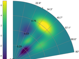
polarPcolor aims to represent a pseudocolour plot in polar coordinates, with a radial grid to allow clear visualization of the data. It is well suited for Plan Position Indicator (PPI) scan for radar or lidar for example [1]. A similar function is available in ref. [2], which propose a visualization in 3D.
References:
[1] Cheynet, E., Jakobsen, J. B., Snæbjörnsson, J., Reuder, J., Kumer, V., & Svardal, B. (2017). Assessing the potential of a commercial pulsed lidar for wind characterisation at a bridge site. Journal of Wind Engineering and Industrial Aerodynamics, 161, 17-26. http://dx.doi.org/10.1016/j.jweia.2016.12.002
[2] http://www.mathworks.com/matlabcentral/fileexchange/13200-3d-polar-plot
Cheynet, E. ECheynet/PolarPcolor v3.8. Zenodo, 2020, doi:10.5281/ZENODO.3774156.
Inspired by: Half polar coordinates figure plot function halfPolar
Find the treasures in MATLAB Central and discover how the community can help you!
Start Hunting!Create scripts with code, output, and formatted text in a single executable document.
Hi Chenyen,
I have updated the submission following your request. Normally, it should be bug-free, but we never know...
The function has a new option called 'typeRose' . If you have [...] = polarpcolor([...],'typeRose' ,'default'), the zero will be oriented toward east and the coordinates will appear in the counterclockwise direction. The default option is, however on 'meteo', i.e. the zero is orientated toward north and the angles follow the clockwise direction. I have included an example in the Matlab livescript Example.mlx
Hello, I really appreciate your work. It's useful!
I have the same question as Seunguk Lee's.
I want the coordinate to appear counterclockwise and change the direction of 0.
"90-myDir" might be a solution but the grids are still unchanged.
How should I change the direction as well as the grids?
Hi Jan,
Thanks for the feedback!
It is possible to use the cardinal points, but I am not sure if it is an option in the current version. If not, the source code has to be modified. It should not be too complicated to implement, though.
Hi there,
I really appreciate your work. Searched a long time for such a plot.
Is there any way to change the 'ThetaTickLabel' for example to the cardinal points?
Thanks a lot!
Hi Bisu,
If you have r, theta, f(r,theta), then most of the work is done. All you need is to do as in the examples provided in the Matlab LiveScript (example 1: "Minimalist example")
Hello, I have a three column data file of the form r, theta, f(r,theta). I want to visualize my data as a polar map. How can I achieve this with this package?
Hi!
I only have two variables: elevation angles (from 3 to 90 degrees) and azimuth angles(from 0 to 360 degrees), as well as the functions P depending on the two variables.
Hi!
So I suppose you have both elevation and azimuth angle. So that means you likely have a third variable such as the " radial distance" to your source. Is it correct?
Hi again!
Supposing R is taken as elevation angles, varing from 3 degree to 90 degree. I wanna set origin as 90 degree, and the outermost circle as 3 degree. Only the circle represents the elevation angle, which isn't related to the radius. I have taken a look at the examples in the .mlx file, however I still don't find the method to solve this problem.
Hi xc q,
Have a look at the examples in the .mlx file. They should help you. Also, I'm not sure I understand how you can have a radius R that both increases (from inner to outer) and decreases at the same time (from 90 to 3).
Hey! Thank you very much for the code.
Supposing R ranges from 3 to 90. How can I specify Origin as R max, that is R changes from 90 (inner) to 3 (outer)?
Hi Jennifer,
Given the low number of data points you have, I suggest that you use a table. Alternatively, you have the following plotting possibilities:
- https://www.mathworks.com/matlabcentral/fileexchange/49488-wind-rose-as-a-scatter-plot
- https://www.mathworks.com/help/matlab/ref/polarscatter.html
Best regards,
Etienne
Thanks so much for laying this out. I am dealing with a fairly small number of data points (8 theta values and 3 r values). Is there any way to smooth the colors? Right now, the graph is very block-y and not a continuous contour. Thanks!
Hei Svante,
I have updated the function for the input parameter "Origin", which is now named "autoOrigin" for the sake of clarity. In the example file (interactive Matlab script), the last section of the example illustrates the use of the option "autoOrigin". In a few words: this option changes the visualization of the area plotted: either an annulus if the lowest value of R is different of zero ("autoOrigin" is 'on') or a disk if "autoOrigin" is 'off'
Hello!
Thank you for the code. I wonder, what is the use of the input parameter "Origin"? How should it be used in different cases? I think the help text does not tell this.
Regards
Svante Björklund
Hi Seunguk Lee,
Assuming that "myDir" is the variable storing the direction from 0 to 360 degree, you can come back to a clockwise orientation with the zero in the eastern direction by writing:
myDir = 90-myDir;
hello! it's pretty good!!!!
i have a question .
With the library now, the data is placed clockwise. But I want the data to be placed counterclockwise. In addition, 0 direction always faces upward. Can I set this direction?
Hi Tudor,
The colorbar is still activated by default on the Matlab version I use (>R2018). Note that the circle for the lowest value of R is normal since I need to "close" the border of the pseudocolour plot. I have updated a new version but I am unsure it will solve your problem.
Hi again,
That is brilliant, thank you! However, I think the colorbar is not activated anymore by default.
And also, my R ranges from 6 to 90, I specify Origin as R min so it starts from 6 (which it does), and then pos = [16 22 34 64] to have circles at 22, 28, 40 and 70. However, the code creates an extra inner circle at Rmin + Origin, so at 12 in my case and I end up with 5 circles rather than 4. Other than that, flawless.
Hi Tudor,
Thank for the suggestions. I have added three new options in the function: One to change the colourmap more easily, one to limit the number of colour used and one to specify the radial grid more freely, i.e. a non-equidistant grid. The example file includes these new options.
Hi there,
This is excellent, thanks a bunch!
I was wondering if you could hardcode the colormap it uses, as colorpmap(jet) does not seem to work, but it works from the Property Editor of the figure.
Also, could you plot this in finer steps? Similar to defining the 'LevelStep' to whatever value in contourf.
Oh and another quick one: can you get the circles at values that are not equidistant? I had a look through your code and you are using linspace; I tried to change that, but it would not work. Example:
tickMesh = linspace(rMin,rMax,Ncircles); %%MODIFY HERE FOR CUSTOM THETA ANGLES
I changed that to something like:
tickMesh = [6 22 28 40 70 90];
Thank you!
This works nicely - thank you.
A small comment: it seems the range of radii is rescaled to the interval [0,1] for plotting; this becomes relevant if one wants to add additional graphical elements to the same plot later.
Hi Amanda,
I had, unfortunately, not the occasion to try the function with macOS. What error message do you get?
@E. Cheynet Thank you for this! Is there a reason why this wouldn't work for macOS?
I noticed one small (possibly intentional?) issue with this function. The function assumes the theta values you give are the start point for each drawn sector, not the center. I would have defined the given theta values as the center of each sector, but it was easy enough to fix by giving an offset to my data before passing it to the program. However, if you do this the spokes are also off (requiring a similar offset to be passed to the program to fix). It might be nice to have an option to set whether to plot centered on the theta data or the current default. Anyway, great work!
Hei James, sorry for the late answer. I have updated the function and included an option to change the radial tick label as you asked. You can see an example where I change the radial label in the live script file.
@E. Cheynet, thanks. Is there a simple way to add labels, i.e. one for each "circle"?
@James, yes it is possible to change the colormap. If you want to use the colormap 'autumn' for example, just write colormap('autumn'). If you want to reverse it, use: colormap(flipud(colormap('autumn')))
Great function. Is it possible to change the color mapping? I am being asked to use a map similar to a temperature weather map where the high temperatures are red.
Hi Etienne,
Now the tool is working flawlessly!!! Many thanks for all help ! The new improved tool is now very complete, easy to use and professional.
All the best,
Gil.
Hi,
I uploaded a simple code and the data in the following link:
https://www.mathworks.com/matlabcentral/fileexchange/68440-polarpcolor-issue
Thanks
Hi Gil,
Is it possible that you send me in PM (using the link in my FileExchange profile) a simple example where polarPcolor fails ? Thank!
Hi Etienne,
I still got the same problem. I think there is still an issue on the rNorm definition.
Hi Gil,
I have seen I had written unproperly the normalization of the R axis when the radial axis is written in a logarithmic format. Now it should work better. Thank again for the feedback!
Hello Etienne,
Many thanks for such a quick reply. What if the RData do not start from values close to 0? what's happening here is that my Rdata starts from 0.13, so the grid it's being drawn shifted upwards and the pcolor is being drawn from the origin.
Hi Gil,
I have updated the function with an option to transform the radial direction from a linear scale to a logarithmic one (See Example.mlx). So far it seems it is working. Do not hesitate to contact me if you find any bug.
Do you have any thoughts on how to draw the circles in a semilog fashion ? I really appreciate any help on this issue.
Thanks !
Many thanks for the reply, Cheynet ! Your tool is really nice and has been very useful for me :)
I have solved the first problem using log10(R), as you said.Then I convert the values back to linear scale in Lines 182 and 196 so it shows the original input labelR values (and not in log values) when plotted. I guess this solves the second problem as I don't need to change the ticks anymore.
Now, the semilog-plot like grid issue has been a nightmare that I could not solve so far. It would be very nice to add a functionality to plot the data like a semilog-plot, specially if we could change the ticks and values to be showed on the grid.
Many thanks
Hi Gil,
Thank for the feedback!
Regarding your first question, you can have the radial axis in semilog if you use log(R) instead of R. However, the grid is not displayed as for a semilog-plot, so that is something to improve in this function. Regarding your second question, I had not implemented the possibility to change the Ticks for the different circles. It can be done by adding a new option in the inputParser object that is at the beginning of the function. I will try to update the function in a near future.
Very usefull tool !!! Is it possible to change the Ticks showed by 'circles' using command lines ? many thanks
Is it possible to have the RAxis in log scale ? like in a semilogx plot ?
Works like a charm, thank you very much.
It's strange that this is not a standard function inside matlab.
Hi Pritesh,
To create your NxN matrix for the variable Z, you can use the Matlab function "griddata":
https://www.mathworks.com/help/matlab/ref/griddata.html
Alternatively, you can try to use a scatter plot instead of a pseudo-color plot, as shown below:
https://www.mathworks.com/matlabcentral/fileexchange/49488-wind-rose-as-a-scatter-plot
hey, really nice piece of work. I have a question particular to my query for your code. I have a 1xN matrice for R and theta. and corresponding 1xN for the Z values. And the cell values in R and theta are not repeating, so I cant really make the Z as NxN matrice with the R and theta having the common values. It was difficult figuring how I could modify your code to suit my requirement. Could you help me out?
https://www.mathworks.com/matlabcentral/answers/357281-color-map-in-polar-axes#comment_487217
This link has an excel sheet with my data points. It would help you understand my question if you just have a look at it. Thanks!
Very useful! Thanks very much for the great work.
I tested on R2013b that works great and your example save my time and your code is understandable
Thank you E. Ch3yn3t !!!
It was just what I was looking for.
It is also well explained from your examples.
It works properly on R2013b.
Cheers,
FS
Thank you again for your patience!
If only a small area is of interest, just "crop" your data around this area. That should also speed up the computation since you would have a matrix with a smaller size.
The matter is:
I use you function to plot a figure, for my data is too large(1126*1000), and the quantities of the nonzero data is small, which lead the figure could not display the spot unless you zoom in it.
Since the data are presented in polar coordinates, "axis(xmin,xmax,ymin,ymax)" is unlikely to be directly useful. Here, the limit of the axis are automatically calculated from R and theta. If you want to modify the axis, just change the extrema of R and theta (cf. last 2 paragraph of the html example).
Thank you for your reply!
I mean I want to know whether their is a function like axis(xmin,xmax,ymin,ymax) to control the display of the figure.
It's very kind of you that solve my problem!
hi McChaucey,
Thanks for the suggestion, that is a good idea !
Are you referring to the colorbar axis ? If yes, I use the function "caxis". I have implemented today a new version where the axis is automatically scaled. In the example file, I also illustrate the role of caxis.
It's pretty good,there are 2 questions.
1st,How to adjust the axis.
2nd,Could u share the version that can adjust the axis adaptively, like image to imagesc.