You are now following this Submission
- You will see updates in your followed content feed
- You may receive emails, depending on your communication preferences
Usage:
OBJ = ConfigurableContainer(CONTAINER)
Inputs:
CONTAINER <1x1 handle>
- Container (figure, uipanel, etc.) to configure the layout of
Outputs:
OBJ <1x1 ConfigurableContainer object handle>
- The ConfigurableContainer object provides easy interactive and/or
programmatic configuration of a container
Description:
ConfigurableContainer provides two ways to easily configure a "parent"
container with a hierarchy of GUI Layout Toolbox HBoxFlex and VBoxFlex
containers. The first is interactively through a UIContextMenu, and
the second is programmatically through its public properties and methods.
HBoxFlex and VBoxFlex containers were chosen as the most flexible
option for configuring a container because they can be interactively
sized by their draggable dividers.
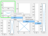
A UIContextMenu is attached to the "parent" container, so it can be
right-clicked to insert a row (HBoxFlex container) or column (VBoxFlex
container). A UIContextMenu is also attached to each inserted HBoxFlex
and VBoxFlex container, allowing any desired hierarchy of rows and
columns to be constructed.
Rows and columns (HBoxFlex and VBoxFlex containers, respectively) can
be inserted, moved, and deleted through the UIContextMenu. Any contents
placed in the HBoxFlex and VBoxFlex containers can be moved and deleted
through the UIContextMenu, given that those contents have had their
'UIContextMenu' properties set with the ConfigurableContainer's
'UIContextMenu' property (see below).
When a configured row or column is right-clicked to bring up its
UIContextMenu some identifying information will be displayed to help
orient the user. The top of the UIContextMenu will show whether a row
or column was clicked along with its "level" in the hierarchy. Also,
the row or column will have its extents/border highlighted. Note,
left-clicking anywhere in the figure will unhighlight the row/column.
ConfigurableContainer's public properties and methods (listed below)
can also be used to programmatically configure the container.
Properties:
- 'Containers' is all the configured containers in the hierarchy
- 'CurrentContainer' is the last configured container the user clicked
- 'UIContextMenu' is the UIContextMenu that provides the interactive
configurable container functionality, which can also be provided to
the contents of the configurable containers
Methods:
- Insert
- Move
- Highlight
- Unhighlight
- findContainers
Note, a delete method is not required because any container or content
can be deleted as normal using the 'delete' function.
Examples:
f = figure;
cc = ConfigurableContainer(f);
r1 = cc.Insert('row', 'above');
c2a = cc.Insert('column', 'right', r1);
c2b = cc.Insert('column', 'right', r1);
axes('Parent', c2b, 'UIContextMenu', cc.UIContextMenu);
cc.Move(c2b, 'left');
cc.Highlight(c2a);
Requires:
GUI Layout Toolbox
HG2 version (R2014b and later): https://www.mathworks.com/matlabcentral/fileexchange/47982-gui-layout-toolbox
References:
https://undocumentedmatlab.com/blog_old/customizing-uicontrol-border
Cite As
Todd Baxter (2026). Configurable Container (https://www.mathworks.com/matlabcentral/fileexchange/75434-configurable-container), MATLAB Central File Exchange. Retrieved .
General Information
- Version 1.0.0 (10.5 KB)
MATLAB Release Compatibility
- Compatible with R2014b and later releases
Platform Compatibility
- Windows
- macOS
- Linux
| Version | Published | Release Notes | Action |
|---|---|---|---|
| 1.0.0 |
