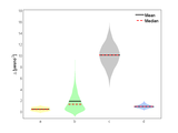
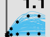
Violin Plot based on kernel density estimation, using default ksdensity
This function creates simple violin plots by estimating the kernel density, using matlabs default ksdensity(). Given a matrix or table with m columns, you will get violins for each of the columns
- 25.7K (All time)
- 87 (Last 30 days)
- 4.9 / 5
- Community
-
3 Nov 2015

Violin Plots for plotting multiple distributions (distributionPlot.m)
Function for plotting multiple histograms side-by-side in 2D - better than boxplot.
The zip-file contains the following files for visualizing distributions:- distributionPlot.m: main function that allows creating violin plots - myHistogram.m: generate histograms with 'ideal' bin
- 14.8K (All time)
- 7 (Last 30 days)
- 5.0 / 5
- Community
-
11 Feb 2017

al_goodplot - boxblot & violin plot
A data distribution visualization that notably includes boxplots and violin plots in a light and clear manner.
The visualization includes: - Raw data - Mean - Median - Standard deviation - Boxplot - Notch - Violin plot (Parzen)Ideal for group comparison, before/after change assessment...Can be typically used
- 1.7K (All time)
- 3 (Last 30 days)
- 4.7 / 5
- Community
-
17 Dec 2021

daviolinplot - violin and raincloud plots
Stylish and comprehensive 2-level factorial data plotting using violin plots, half-violin plots, boxplots, raincloud plots, and dotplots
. It combines boxplots, kernel density, and data scatter to produce different hybrids of violin plots, half-violin plots, raincloud plots, and dotplots. Kernel density highlights the overall shape of the
- 3K (All time)
- 33 (Last 30 days)
- 5.0 / 5
- Community
-
8 Jan 2025
Management of data tables, similar to dataframe in R, with enhanced plotting facilities.
array together with row names, column names, table name. It also supports factor columns, such as categorical factors ("yes", "no"). Several utility methods are provided, and many plot functions have been
- 2.6K (All time)
- 6 (Last 30 days)
- 5.0 / 5
- Community
-
29 Feb 2024

- Combined Sina, Violin, and Box plot with stats panel
sinaViolinBoxPlot is a versatile MATLAB function for visualizing grouped data distributions. It combines the strengths of three common plot types:Violin plots using KDE for smooth density
- 16 (All time)
- 3 (Last 30 days)
- 5.0 / 5
- Community
-
5 Dec 2025

Generate beautiful violin plots with professional themes.
Basic usage% X - Group positions.% Y - Matrix data.X = 1:5;Y = randn(100, 5);violinChart(gca, X, Y, 'Width',.8);legend()Categorical dataX = randi([1, 5], [1, 200]);Y = randn(1, 200) + sin(X);hdl =
- 323 (All time)
- 6 (Last 30 days)
- -- / 5
- Community
-
28 May 2026
- 3.3K (All time)
- 2 (Last 30 days)
- 4.0 / 5
- Community
-
9 Apr 2021

The COnstraint-Based Reconstruction and Analysis Toolbox
Creation and analysis of biochemical constraint-based models: the COBRA Toolbox v3.0
- 5K (All time)
- 28 (Last 30 days)
- 3.7 / 5
- Community
-
1 Feb 2024

- 488 (All time)
- 5 (Last 30 days)
- 5.0 / 5
- Community
-
23 Jul 2020
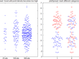
Scatter plot with dispersion along the x-axis to reflect the point density
Scatter plot with categories on the x-axis, with width determined by data point density (like a violin plot but with the width of the violin not explicitly drawn but rather setting the x-axis
- 197 (All time)
- 2 (Last 30 days)
- 5.0 / 5
- Community
-
3 Jun 2019

Violin Plot with mean, median and interquartile range
get violin plots from your data
% This function generates a violin plot for each dataset provided as input. % Violin plots are estimated from histcounts MATLAB function. % The thick line in the box represents the
- 45 (All time)
- 2 (Last 30 days)
- -- / 5
- Community
-
8 Nov 2024

- 23 (All time)
- 1 (Last 30 days)
- -- / 5
- Community
-
8 Nov 2023

Creates (scatter, contour, regression, etc.) main plot with upper and right marginal distributions (histogram, boxplot, violin, rug, etc.).
Kernel density area + line% 5 | 'kd-hist' | Histogram overlayed with kernel density line% 6 | 'box' | Box plot (median, quartiles, outliers)% 7 | 'violin' | Full violin plot
- 247 (All time)
- 9 (Last 30 days)
- 5.0 / 5
- Community
-
13 Jun 2026

Multidimensional Analysis Pipeline for Histocytometry (CytoMAP) https://gitlab.com/gernerlab/cytomap
- 576 (All time)
- 4 (Last 30 days)
- -- / 5
- Community
-
22 Apr 2023

Violin Plots for Matlab
Violin Plots for MatlabA violin plot is an easy to read substitute for a box plot thatreplaces the box shape with a kernel density estimate of the data, andoptionally overlays the data points itself
- 2.8K (All time)
- 73 (Last 30 days)
- -- / 5
- Community
-
23 Jul 2024

Statistical testing and plots with significance level
Basic representations of two data groups as stripcharts and violin plots. Mann-Whitney U test and t-test are performed with significance level indicators.Dot plots and violin plots are described here
- 268 (All time)
- 1 (Last 30 days)
- 5.0 / 5
- Community
-
31 Oct 2023

ggtheme for Common Plotting Functions
Apply professional theme styles to common MATLAB plotting functions (bar, line, area, box, violin). Inspired by R's ggthemr package.
')%% Apply ggtheme styling to both subplotspause(.5)ggThemeBar(ax1, 'dust');ggThemeBar(ax2, 'dust');exportgraphics(gcf, '_demoBar_gg.png')Basic usage - plot% demoPlotfigure('Units','normalized
- 15 (All time)
- 4 (Last 30 days)
- 5.0 / 5
- Community
-
12 May 2026

CIAtah (i.e. calciumImagingAnalysis)
CIAtah is a software package for calcium imaging analysis of one- and two-photon imaging datasets. https://github.com/bahanonu/ciatah
- 588 (All time)
- 3 (Last 30 days)
- -- / 5
- Community
-
24 Jul 2024

GroupDistributionPlot: Violin, Sina, Box & Histogram
Grouped violin, sina scatter, box, and histogram plots for 1–2 categorical factors.Colorblind-safe palettes. Publication-ready MATLAB output
featuresFour complementary plot elements can be shown simultaneously or in any combination:Violin plot — kernel density estimate rendered as a filled polygon, with optional symmetric, left-only, or right-only
- 12 (All time)
- 1 (Last 30 days)
- -- / 5
- Community
-
28 Apr 2026
gQSPsim
parallel cohort generation and simulation* improved cross-platform compatibility of sessions* limit configurable number of traces to show when rendering plots* improvements to selection of rules/reactions to
- 344 (All time)
- 2 (Last 30 days)
- -- / 5
- Community
-
14 Aug 2023
Violin plot
Simple violin plot function using 'fitdist' and 'patch' function.Options to make 1-sided violins, rotate the violin horizontally and add a line for the median.
- 531 (All time)
- 1 (Last 30 days)
- 3.7 / 5
- Community
-
13 Aug 2019

This function generates a violin plot with the IQR and median value highlighted.
This function generates a violin plot with the IQR and median value highlighted.
- 21 (All time)
- 2 (Last 30 days)
- -- / 5
- Community
-
19 Jun 2023
- 1.1K (All time)
- 1 (Last 30 days)
- 4.5 / 5
- Community
-
14 Aug 2023

An open-source MATLAB tool for drawing box plot and violin plot with automatic multi-way data grouping.
grpandplot: An open-source MATLAB tool for drawing box plot and violin plot with automatic multi-way data grouping.Man Ho Wong, 2022.Introductiongrpandplot features data grouping by multiple factors
- 429 (All time)
- 3 (Last 30 days)
- -- / 5
- Community
-
19 Apr 2023

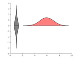
violin plots for strictly positive data.
: https://fr.mathworks.com/matlabcentral/fileexchange/23661-violin-plots-for-plotting-multiple-distributions-distributionplot-m
- 60 (All time)
- 1 (Last 30 days)
- -- / 5
- Community
-
11 Dec 2018

Draw a box plot with various display options
Automated construction of a legend. - Set box limits as percentiles. - Set whisker extent via various methods.- Use of weighted quantiles.- Creation of violin plots.
- 10.9K (All time)
- 5 (Last 30 days)
- 4.7 / 5
- Community
-
28 Jun 2017
- 68 (All time)
- 1 (Last 30 days)
- -- / 5
- Community
-
20 Dec 2018

dabarplot - beautiful grouped and stacked bar plots
Bar plots for multiple conditions and groups (part of a larger toolbox for 2-level factorial data)
highlighitng data distribution properties. It combines boxplots, kernel density, and data scatter to produce different hybrids of violin plots, half-violin plots, raincloud plots, and dotplots. Kernel density
- 389 (All time)
- 5 (Last 30 days)
- 5.0 / 5
- Community
-
16 Jul 2024
plot spread points (beeswarm plot)
plotSpread plots distributions of data points, adding jitter to the points to avoid overlap.
plotSpread allows creating "beeswarm plots", i.e. point distributions where jitter has been added to the data points to avoid overlap.It further allows specifying groups within the data to show the
- 12.8K (All time)
- 9 (Last 30 days)
- 4.9 / 5
- Community
-
11 Feb 2017

AbstractGeek/CategoricalScatterplot
An improved box plot that shows the data-points along with the median and the quartiles.
underlying distribution (similar to violin plots).The code is designed to be an extremely customizable alternate for the built in boxplot function in MATLAB. The syntax is very similar to that of boxplot.
- 669 (All time)
- 1 (Last 30 days)
- 5.0 / 5
- Community
-
13 Dec 2016

Bode plot with asymptotes
The function asymp() corresponds to bode(), but it also plots asymptotes for the magnitude and phase graphs. Phase asymptotes are only horizontal and vertical. asymp() only accepts SISO transfer
- 29K (All time)
- 54 (Last 30 days)
- 4.7 / 5
- Community
-
22 Sep 2020
- 7.1K (All time)
- 8 (Last 30 days)
- 4.7 / 5
- Community
-
31 Oct 2012
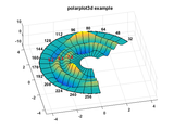
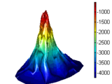
Plots 3d polar data with polar axis and polar grid
Polarplot3d produces surface, mesh, wireframe and contour plots for three dimensional polar data. A labeled polar axis is drawn at a fixed height or it can follow the surface contour at maximum
- 25.7K (All time)
- 9 (Last 30 days)
- 4.9 / 5
- Community
-
4 Mar 2016

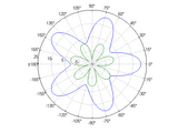
Create a spider or radar plot with individual axes.
[](https://www.mathworks.com/matlabcentral/fileexchange/59561-spider_plot)[
This simple code enables you to plot using custom markers.
This simple code enables you to plot using custom markers. It uses custom patches instead of Matlab built-in markers.As the input, you need to provide x and y for the data points, like you do in
- 2.4K (All time)
- 3 (Last 30 days)
- 4.9 / 5
- Community
-
17 Dec 2012

MATLAB Plot Gallery - Plot in Plot
Create a plot in plot
This is an example of how to create an inset plot within another plot in MATLAB®.Read about the "axes" function in the MATLAB documentation.For more examples, go to MATLAB Plot Gallery -
- 4K (All time)
- 2 (Last 30 days)
- 5.0 / 5
- Community
-
19 Dec 2018
Makes MATLAB's line plots much faster.
This simple tool intercepts data going into a plot and reduces it to the smallest possible set that looks identical given the number of pixels available on the screen. It then updates the data as a
- 5.5K (All time)
- 6 (Last 30 days)
- 4.8 / 5
- Community
-
12 Jun 2015

Generate a bar plot with multiple stacks grouped together.
Plot a set of stacked bars, but group them according to labels provided.Params: stackData is a 3D matrix (i.e., stackData(i, j, k) => (Group, Stack, StackElement)) groupLabels is a CELL
- 12.6K (All time)
- 10 (Last 30 days)
- 4.8 / 5
- Community
-
13 Sep 2011
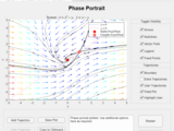
Plot the phase portrait for the entered system of differential equations
using the app. The app works with limited functionality for versions preceding R2020b. For versions prior to R2020b, mouse click interactions with the plots (adding trajectories and guessing solutions) do
- 8.7K (All time)
- 63 (Last 30 days)
- 5.0 / 5
- Community
-
28 Mar 2021

Professional Standard Plots within Seconds!!! Take your plots to the next level.
Create Professional standard plots in seconds, without a steep learning curve and with consistency. This Toolbox is supposed to help 'Beginners' take their plots to the next level with essentially
- 4.4K (All time)
- 12 (Last 30 days)
- 4.7 / 5
- Community
-
19 Oct 2022
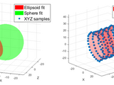
Object-oriented tools to fit/plot conics and quadrics
A tool set for fitting and/or plotting various conics and quadric surfaces, e.g., ellipses, cylinders, spheres, planes, cones, and lines.
This FEX submission offers a tool set for fitting and plotting 2D conics (ellipses, circles, lines,...) as well as 3D quadric surfaces (ellipsoids, spheres, planes, cylinders, cones,...). Each type
- 2.3K (All time)
- 12 (Last 30 days)
- 5.0 / 5
- Community
-
8 Feb 2024
Produces a plot who's y-axis skips to avoid unnecessary blank space
Produces a plot who's y-axis skips to avoid unecesary blank spaceReplaces BREAKAXIS
- 16.8K (All time)
- 17 (Last 30 days)
- 5.0 / 5
- Community
-
12 Nov 2008
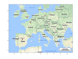
Plot a google map on the background of the current figure using the Static Google Maps API.
plot_google_map.m uses the Google Maps API to plot a map in the background of the current figure. It assumes the coordinates of the current figure are in the WGS84 datum, and uses a conversion code
- 32K (All time)
- 12 (Last 30 days)
- 4.9 / 5
- Community
-
22 Apr 2020

The program plots convex linear closed regions in 2D/3D.
The program plots convex linear closed regions in 2D/3D. The region is a subset of R2 or R3 such that Ax>=b and lb<=x<=ub. It is also possible to plot points in the same plot.(See help
- 16.8K (All time)
- 3 (Last 30 days)
- 4.6 / 5
- Community
-
24 Jun 2025

Creates a contour plot from polar coordinates
Have you ever wanted to do a contour plot of data in polar coordinates but didn't want to go through the hassle of converting it all to Cartesian coordinates? Well if so, here's your answer. A
- 5.7K (All time)
- 1 (Last 30 days)
- 4.4 / 5
- Community
-
18 Jun 2007
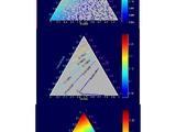
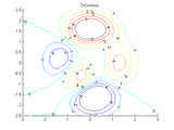
Zip file contains program to make different ternary plots.
This zip files contains programs (five functions, one example program, and one sample data set) to plot data in ternary diagrams. The first option is a pseudo color plot, the second is a contour plot
- 16.2K (All time)
- 19 (Last 30 days)
- 4.5 / 5
- Community
-
6 Jun 2005

Plotting function that allows for N y-axes using a common x axis
This function allows for results to be plotted on N separate y-axes. These y-axes share a common x axis, but do not need to share exactly the same x/y data or size. The function supports all
- 3.4K (All time)
- 13 (Last 30 days)
- 4.9 / 5
- Community
-
11 Aug 2019
Polar plots with handle graphics type parameter setting. Includes log radius support.
Attempts to bring comprehensive handle graphics capabilities to polar plots.
- 5.4K (All time)
- 1 (Last 30 days)
- 4.9 / 5
- Community
-
31 Oct 2012

Plots the gridded data as a surface.
interpolation method. While other methods make gridline-registered grids that can be plotted using e.g. Mtlab surf function, this function makes a pixel registered grid and uses the Matlab patch function to
- 687 (All time)
- 2 (Last 30 days)
- 5.0 / 5
- Community
-
25 Mar 2014
Making Surface Plots From Scatter Data
How to turn a collection of XYZ triplets into a surface plot.
How do you turn a collection of XYZ triplets into a surface plot? This is the most frequently asked 3D plotting question that I got when I was in Tech Support. This submission explains how.
- 38.6K (All time)
- 5 (Last 30 days)
- 4.6 / 5
- Community
-
1 Sep 2016
Plots 3D polar data with axes.
Polar3D plots 3 dimensional data given angular and radial ranges. A choice of plot types and interpolation methods is supported by this function. Useful particularly in producing 3D plots sampled on
- 20.6K (All time)
- 1 (Last 30 days)
- 4.8 / 5
- Community
-
8 Mar 2006
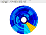
This function creates smooth patches of polar data in "bullseye" plot.
BULLSEYE plots patch data in polar coordinates. The DATA matrix is mapped to a bullseye plot as follows. The matrix rows are mapped to the circumference and matrix columns are mapped to radial
- 3K (All time)
- 2 (Last 30 days)
- 5.0 / 5
- Community
-
31 Mar 2016

Stacked plots display spectra with time or another parameter. Five methods are provided.
Stacked plots are commonly seen in NMR spectroscopy. They often illustrate the evolution of spectra with time or some other parameter. There are several (somewhat equivalent) methods to produce such
- 5.2K (All time)
- 5 (Last 30 days)
- 5.0 / 5
- Community
-
11 Apr 2020

Functions to generate fully customizable polar plots including compass orientation and circle segments.
Although current versions of Matlab do offer some polar plotting functionality, it isn't particularly flexible. "Perfect Polar Plots" is a few functions which can be used to create fully customizable
- 1K (All time)
- 5 (Last 30 days)
- 4.9 / 5
- Community
-
19 Jan 2020
Stacked line plots from a matrix or vectors
) contained in the rows of an input 2-D matrix. Each wave has a designated row on the plot. Data may also be specified as vectors X, Y, and Z. The plot is similar to a cascade or waterfall plot.
- 2K (All time)
- 2 (Last 30 days)
- 5.0 / 5
- Community
-
11 Aug 2016
ScrollPlot - scrollable X/Y axes
ScrollPlot adds a scroll sub-window to any supplied plot handles
ScrollPlot adds a scroll sub-window to any supplied plot handles (or current [gca] axes if no handle was supplied). This enables easy plot or image exploration. The user can specify initial view
- 10.5K (All time)
- 3 (Last 30 days)
- 4.8 / 5
- Community
-
16 Jul 2015

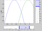
Adds zoomed plot inset to current axes.
Adds a zoomed plot inset to current axes, for use in highlighting a subarea of the current plot. [p,z] = zoomPlot(x,y,xbounds,pos,vertex) where: Inputs:x,y = vectors being plottedxbounds =
- 4.4K (All time)
- 18 (Last 30 days)
- 4.5 / 5
- Community
-
23 Oct 2016

Creates a one legend for many sub-plots in the same figure with your customized location
This script creates a one legend for many sub-plots in the same figure located in a customized location with a guidelines for most common location used while creating Matlab files
- 1.8K (All time)
- 1 (Last 30 days)
- 5.0 / 5
- Community
-
2 Nov 2010
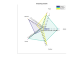
A variant on radar/spider plot where different dimensions can have different scaling
Plot NxM arrays as N different objects in a "scalar" M-dimensional space.
- 547 (All time)
- 1 (Last 30 days)
- 5.0 / 5
- Community
-
13 Oct 2016