hist
(Not recommended) Histogram plot
hist is not recommended. Use histogram instead.
For more information, including suggestions on updating code, see Replace Discouraged Instances of hist and histc.
Description
hist( creates a histogram bar chart of the
elements in vector x)x. The elements in x are sorted
into 10 equally spaced bins along the x-axis between the minimum and
maximum values of x. hist displays bins as
rectangles, such that the height of each rectangle indicates the number of elements in the
bin.
If the input is a multi-column array, hist creates histograms for
each column of x and overlays them onto a single plot.
If the input is of data type categorical, each bin is a category of
x.
hist( sorts
x,xbins)x into bins with intervals or categories determined by the vector
xbins.
If
xbinsis a vector of evenly spaced values, thenhistuses the values as the bin centers.If
xbinsis a vector of unevenly spaced values, thenhistuses the midpoints between consecutive values as the bin edges.If
xis of data typecategorical, thenxbinsmust be a categorical vector or cell array of character vectors that specifies categories.histplots bars only for those categories.
The length of the vector xbins is equal to the number of
bins.
hist( plots into the axes
specified by ax,___)ax instead of into the current axes
(gca). The option ax can precede any of the input
argument combinations in the previous syntaxes.
Examples
x = [0 2 9 2 5 8 7 3 1 9 4 3 5 8 10 0 1 2 9 5 10];
hist(x)
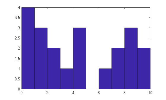
hist sorts the values in x among 10 equally spaced bins between the minimum and maximum values in the vector, which are 0 and 10 in this example.
Generate three columns of 1,000 random numbers and plot the three column overlaid histogram.
x = randn(1000,3);
hist(x)
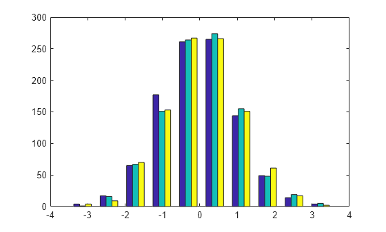
The values in x are sorted among 10 equally spaced bins between the minimum and maximum values. hist sorts and bins the columns of x separately and plots each column with a different color.
Plot a histogram of 1,000 random numbers sorted into 50 equally spaced bins.
x = randn(1000,1);
nbins = 50;
hist(x,nbins)

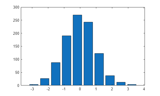
Generate 1,000 random numbers. Count how many numbers are in each of 10 equally spaced bins. Return the bin counts and bin centers.
x = randn(1000,1);
[counts,centers] = hist(x)
counts = 1×10

     4    27    88   190   270   243   123    38    13     4
centers = 1×10

   -2.8915   -2.2105   -1.5294   -0.8484   -0.1673    0.5137    1.1947    1.8758    2.5568    3.2379
Use bar to plot the histogram.
bar(centers,counts)
Generate 1,000 random numbers and create a histogram.
data = randn(1000,1);
hist(data)
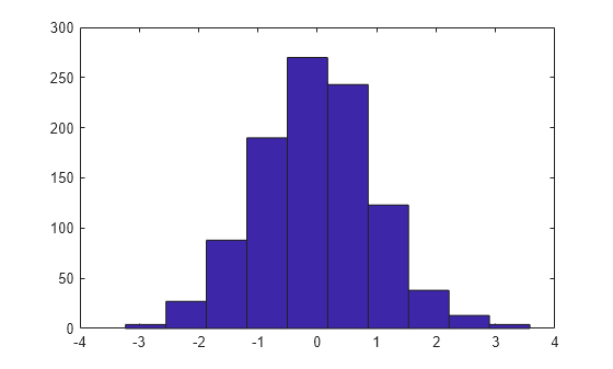
Get the handle to the patch object that creates the histogram plot.
h = findobj(gca,'Type','patch');
Set the face color of the bars plotted to an RGB triplet value of [0 0.5 0.5]. Set the edge color to white.
h.FaceColor = [0 0.5 0.5];
h.EdgeColor = 'w';
Input Arguments
Output Arguments
Extended Capabilities
Version History
Introduced before R2006a