Create Heatmap from Tabular Data
Heatmaps are a way to visualize data using color. When you call the heatmap function, you can specify unaggregated or pre-aggregated data:
If you specify unaggregated data in the form of a table, the
heatmapfunction aggregates the data and displays numbers and colors in each cell that reflect the aggregated values. For example, the cells might show the number of times each (x, y) pair appears in the table. The labels along the x- and y-axes show the unique values in the table.If you specify data in the form of a 2-D matrix, the
heatmapfunction treats the values as aggregated data. Each element of the matrix corresponds to a cell in the chart. The color of a cell indicates how large or small a value in the matrix is relative to the other values in the matrix. You can optionally specify labels that appear along the x- and y-axes of the chart.
This topic shows how to import a file into MATLAB® as a table and create a heatmap from the table columns. It also shows how to modify the appearance of the heatmap, such as setting the title and axis labels.
Import File as Table
Load the sample file TemperatureData.csv, which contains average daily temperatures from January 2015 through July 2016. Read the file into a table and display the first five rows.
tbl = readtable('TemperatureData.csv');
head(tbl,5)
Year Month Day TemperatureF
____ ___________ ___ ____________
2015 {'January'} 1 23
2015 {'January'} 2 31
2015 {'January'} 3 25
2015 {'January'} 4 39
2015 {'January'} 5 29
Create Basic Heatmap
Create a heatmap that shows the months along the x-axis and years along the y-axis. Color the heatmap cells using the temperature data by setting the ColorVariable property. Assign the HeatmapChart object to the variable h. Use h to modify the chart after it is created.
h = heatmap(tbl,'Month','Year','ColorVariable','TemperatureF');
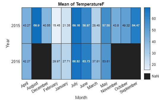
By default, MATLAB calculates the color data as the average temperature for each month. However, you can change the calculation method by setting the ColorMethod property.
Reorder Values Along Axis
The values along an axis appear in alphabetical order. Reorder the months so that they appear in chronological order. You can customize the labels using categorical arrays or by setting HeatmapChart properties.
To use categorical arrays, first change the data in the Month column of the table from a cell array to a categorical array. Then use the reordercats function to reorder the categories. You can apply these functions to the table in the workspace (tbl) or to the table stored in the SourceTable property of the HeatmapChart object (h.SourceTable). Applying them to the table stored in the HeatmapChart object avoids affecting the original data.
h.SourceTable.Month = categorical(h.SourceTable.Month);
neworder = {'January','February','March','April','May','June','July',...
    'August','September','October','November','December'};
h.SourceTable.Month = reordercats(h.SourceTable.Month,neworder);
Similarly, you can add, remove, or rename the heatmap labels using the addcats, removecats, or renamecats functions for categorical arrays.
Alternatively, you can reorder the values along an axis using the XDisplayData and YDisplayData properties of the HeatmapChart object.
h.XDisplayData = {'January','February','March','April','May','June', ...
    'July','August','September','October','November','December'};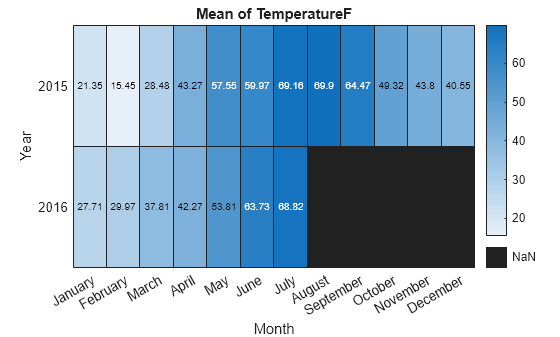
Modify Title and Axis Labels
When you create a heatmap using tabular data, the heatmap automatically generates a title and axis labels. Customize the title and axis labels by setting the Title, XLabel, and YLabel properties of the HeatmapChart object. For example, change the title and remove the x-axis label. Also, change the font size.
h.Title = 'Average Temperatures';
h.XLabel = '';
h.FontSize = 12;

Modify Appearance of Missing Data Cells
Since there is no data for August 2016 through December 2016, those cells appear as missing data. Modify the appearance of the missing data cells using the MissingDataColor and MissingDataLabel properties.
h.MissingDataColor = [0.8 0.8 0.8];
h.MissingDataLabel = 'No Data';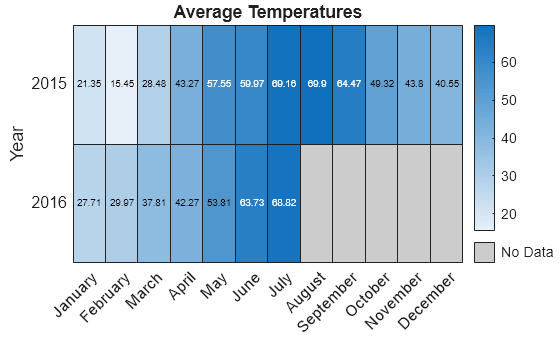
Remove Colorbar
Remove the colorbar by setting the ColorbarVisible property.
h.ColorbarVisible = 'off';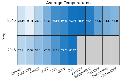
Format Cell Text
Customize the format of the text that appears in each cell by setting the CellLabelFormat property. For example, display the text with no decimal values.
h.CellLabelFormat = '%.0f';
Add or Remove Values Along Axis
Show only the first month of each quarter by setting the XDisplayData property. Add the year 2017 along the y-axis by setting the YDisplayData property. Set these properties to a subset, superset, or permutation of the values in XData or YData, respectively.
h.XDisplayData = {'January','April','July','October'};
h.YDisplayData = {'2015','2016','2017'};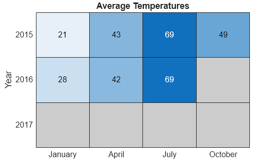
Since there is no data associated with the year 2017, the heatmap cells use the missing data color.
See Also
Functions
heatmap|table|readtable|addcats|removecats|renamecats|reordercats|categorical