scatterhistogram
Create scatter plot with histograms
Syntax
Description
scatterhistogram(___,
specifies additional options for the scatter plot with marginal histograms using one or
more name-value pair arguments. Specify the options after all other input arguments. For a
list of properties, see ScatterHistogramChart Properties.Name,Value)
scatterhistogram(
creates the scatter plot with marginal histograms in the figure, panel, or tab specified
by parent,___)parent.
s = scatterhistogram(___)ScatterHistogramChart object. Use s to
modify the object after you create it. For a list of properties, see ScatterHistogramChart Properties.
Examples
Create a scatter plot with marginal histograms from a table of data for medical patients.
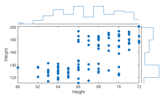
Load the patients data set and create a table from a subset of the variables loaded into the workspace. Then, create a scatter histogram chart comparing the Height values to the Weight values.
load patients
tbl = table(LastName,Age,Gender,Height,Weight);
s = scatterhistogram(tbl,'Height','Weight');
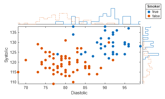
Using the patients data set, create a scatter plot with marginal histograms and specify the table variable to use for grouping the data.
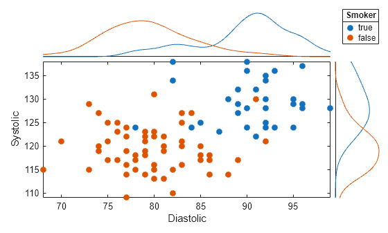
Load the patients data set and create a scatter histogram chart from the data. Compare the patients' Systolic and Diastolic values. Group the data according to the patients' smoker status by setting the 'GroupVariable' name-value pair argument to 'Smoker'.
load patients
tbl = table(LastName,Diastolic,Systolic,Smoker);
s = scatterhistogram(tbl,'Diastolic','Systolic','GroupVariable','Smoker');
Use a scatter plot with marginal histograms to visualize categorical and numeric medical data.
Load the patients data set, and convert the Smoker data to a categorical array. Then, create a scatter histogram chart that compares patients' Age values to their smoker status. The resulting scatter plot contains overlapping data points. However, the y-axis marginal histogram indicates that there are far more nonsmokers than smokers in the data set.
load patients
Smoker = categorical(Smoker);
s = scatterhistogram(Age,Smoker);
xlabel('Age')
ylabel('Smoker')

Create a scatter plot with marginal histograms using arrays of shoe data. Group the data according to shoe color, and customize properties of the scatter histogram chart.
Create arrays of data. Then, create a scatter histogram chart to visualize the data. Use custom labels along the x-axis and y-axis to specify the variable names of the first two input arguments. You can specify the title, axis labels, and legend title by setting properties of the ScatterHistogramChart object.
xvalues = [7 6 5 6.5 9 7.5 8.5 7.5 10 8];
yvalues = categorical({'onsale','regular','onsale','onsale', ...
    'regular','regular','onsale','onsale','regular','regular'});
grpvalues = {'Red','Black','Blue','Red','Black','Blue','Red', ...
    'Red','Blue','Black'};
s = scatterhistogram(xvalues,yvalues,'GroupData',grpvalues, ...
    LegendVisible = "on");

s.Title = 'Shoe Sales';
s.XLabel = 'Shoe Size';
s.YLabel = 'Price';
s.LegendTitle = 'Shoe Color';
Change the colors in the scatter histogram chart to match the group labels. Change the histogram bin widths to be the same for all groups.
s.Color = {'Red','Black','Blue'};
s.BinWidths = 1;
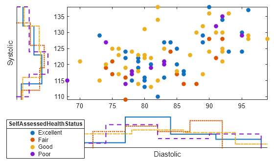
Create a scatter plot with marginal histograms. Specify the number of bins and line widths of the histograms, the location of the scatter plot, and the legend visibility.
Load the patients data set and create a scatter histogram chart from the data. Compare the patients' Diastolic and Systolic values, and group the data according to the patients' SelfAssessedHealthStatus values. Adjust the histograms by specifying the NumBins and LineWidth options. Place the scatter plot in the 'NorthEast' location of the figure by using the ScatterPlotLocation option. Ensure the legend is visible by specifying the LegendVisible option as 'on'.
load patients
tbl = table(LastName,Diastolic,Systolic,SelfAssessedHealthStatus);
s = scatterhistogram(tbl,'Diastolic','Systolic','GroupVariable','SelfAssessedHealthStatus', ...
    'NumBins',4,'LineWidth',1.5,'ScatterPlotLocation','NorthEast','LegendVisible','on');
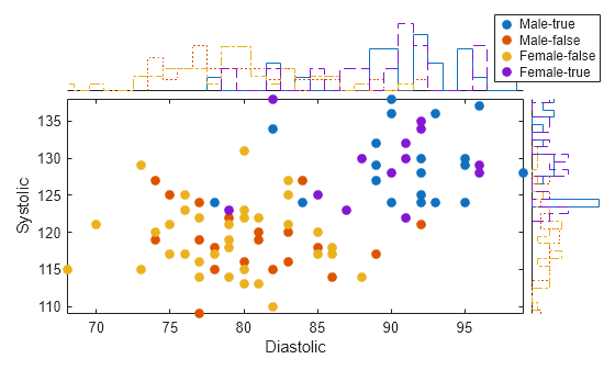
Create a scatter plot with marginal histograms. Group the data by using a combination of two different variables.
Load the patients data set. Combine the Smoker and Gender data to create a new variable. Create a scatter histogram chart that compares the Diastolic and Systolic values of the patients. Use the new variable SmokerGender to group the data in the scatter histogram chart.
load patients
[idx,genderStatus,smokerStatus] = findgroups(string(Gender),string(Smoker));
SmokerGender = strcat(genderStatus(idx),"-",smokerStatus(idx));
s = scatterhistogram(Diastolic,Systolic,'GroupData',SmokerGender,'LegendVisible','on');
xlabel('Diastolic')
ylabel('Systolic')
Create a scatter plot with marginal kernel density histograms.
Load the patients data set. Create a table from the Diastolic, Systolic, and Smoker variables.
load patients.mat
tbl = table(Diastolic,Systolic,Smoker);
Create a scatter histogram chart that compares the Diastolic and Systolic pressure values of the patients. Use patient smoking status to group the data and display marginal kernel density plots. The plot shows that smokers have higher average systolic and diastolic blood pressure compared to nonsmokers.
s = scatterhistogram(tbl,"Diastolic","Systolic", ...
    GroupVariable="Smoker",HistogramDisplayStyle="smooth", ...
    LineStyle="-");
Input Arguments
Name-Value Arguments
Specify optional pairs of arguments as
Name1=Value1,...,NameN=ValueN, where Name is
the argument name and Value is the corresponding value.
Name-value arguments must appear after other arguments, but the order of the
pairs does not matter.
Before R2021a, use commas to separate each name and value, and enclose
Name in quotes.
Example: scatterhistogram(tbl,xvar,yvar,'GroupVariable',grpvar,'HistogramDisplayStyle','stairs')
specifies grpvar as the grouping variable and displays stairstep plots
next to the scatter plot.
Note
The properties listed here are only a subset. For a complete list, see ScatterHistogramChart Properties.
Choose among these marker options.
| Marker | Description | Resulting Marker |
|---|---|---|
"o" | Circle |
|
"+" | Plus sign |
|
"*" | Asterisk |
|
"." | Point |
|
"x" | Cross |
|
"_" | Horizontal line |
|
"|" | Vertical line |
|
"square" | Square |
|
"diamond" | Diamond |
|
"^" | Upward-pointing triangle |
|
"v" | Downward-pointing triangle |
|
">" | Right-pointing triangle |
|
"<" | Left-pointing triangle |
|
"pentagram" | Pentagram |
|
"hexagram" | Hexagram |
|
"none" | No markers | Not applicable |
By default, scatterhistogram assigns the marker symbol
'o' to each group in the scatter plot. When the total number of
groups exceeds the number of specified symbols, scatterhistogram
cycles through the specified symbols.
Example: s = scatterhistogram(__,'MarkerStyle','x')
Example: s.MarkerStyle = {'x','o'}
Output Arguments
More About
Tips
To interactively explore the data in your
ScatterHistogramChartobject, use these options. Some of these options are not available in the Live Editor.Zoom/pan — Use the scroll wheel or the + and - buttons to zoom. Click and drag the scatter plot to pan.
scatterhistogramupdates the marginal histograms based on the data within the current scatter plot limits.Data tips — Hover over the scatter plot or marginal histograms to display a data tip.
If you create a scatter plot with marginal histograms from a table, then you can customize data tips for the scatter plot.
To add or remove a row from the data tip, right-click anywhere on the scatter plot and point to Modify Data Tips. Then, select or deselect a variable.
To add or remove multiple rows, right-click on the plot, point to Modify Data Tips, and select More. Then, add variables by clicking >> or remove them by clicking <<.