Visualize Sea Ice Concentrations from GRIB Data
Visualize sea ice concentrations for an arctic region using data stored in the GRIB file format. GRIB files typically store meteorological, hydrological, or oceanographic data. In many cases, GRIB files store data using multiple bands. This example shows you how to:
View sea ice concentrations for a single year.
Animate sea ice concentrations over time.
Compare sea ice concentrations for multiple years using histograms.
This example uses data from a GRIB file containing sea ice concentrations for 2010, 2012, 2014, 2016, 2018, 2020, and 2022 [1][2]. The file stores the data as a grid of posting point samples referenced to geographic coordinates.
Visualize Concentrations for Single Year
Visualize sea ice concentrations for 2010 by using a map axes object.
Get Information About GRIB File
Get information about the GRIB file by creating a RasterInfo object. Extract the latitude limits, longitude limits, reference times, and number of bands from the object. Each data band corresponds to a year.
info = georasterinfo("seaice.grib");
latlim = info.RasterReference.LatitudeLimits;
lonlim = info.RasterReference.LongitudeLimits;
refTime = info.Metadata.ReferenceTime;
numBands = info.NumBands;
Read Data Band
Read the data band for 2010 by using the metadata stored in the RasterInfo object. RasterInfo objects store GRIB metadata using a table, where each row of the table corresponds to a data band.
Find the band that contains data for 2010.
yrs = year(info.Metadata.ReferenceTime);
band2010 = find(yrs == 2010);
Extract the band for 2010. Convert the concentrations to percentages.
[iceConcentration2010,R2010] = readgeoraster("seaice.grib",Bands=band2010);
percentIce2010 = 100*iceConcentration2010;
Get the reference time for the band.
refTime2010 = refTime(band2010);
refTime2010 = string(refTime2010,"MMMM d, yyyy");
Display Data Band
Load an ice colormap that is appropriate for ice concentration data. The colormap starts at dark blue and transitions to light blue and white.
load iceColormap.matSpecify ice concentration levels from 0% to 100%. The level increases every 5%.
levels = 0:5:100;
Set up a map axes object for an arctic region by using the setUpArcticMapAxes helper function. The function creates a map in a polar stereographic projection, sets the colormap, and adds a labeled color bar. Specify the colormap using the ice colormap. Specify the tick labels for the color bar using the ice concentration levels.
figure
setUpArcticMapAxes(iceColormap,levels)
Display the sea ice concentrations using a pseudocolor raster plot, which applies color using the colormap of the axes. Then, provide geographic context for the map by displaying a subset of world land areas in gray.
geopcolor(percentIce2010,R2010)

land = readgeotable("landareas.shp");
subland = land(2:end,:);
landColor = [0.8 0.8 0.8];
geoplot(subland,FaceColor=landColor,FaceAlpha=1)
Add a title and subtitle.
title("Sea Ice Concentrations")
subtitle(refTime2010)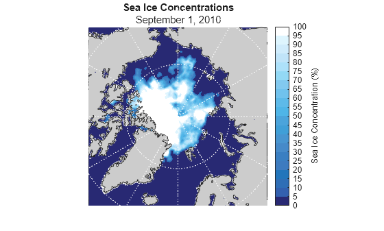
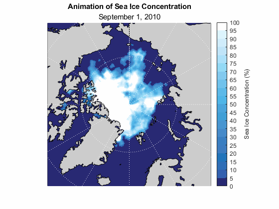
Animate Concentrations Over Time
Visualize sea ice concentrations over time by using an animated GIF.
Read Data for All Bands
Read all the data bands into the workspace. Convert the concentrations to percentages.
[iceConcentration,R] = readgeoraster("seaice.grib");
percentIce = 100 * iceConcentration;
Create Animated GIF
Create an animated GIF and save it to a file.
Set up a new map axes object by using the setUpArcticMapAxes helper function. Avoid displaying the animation by using an invisible figure. Add a title.
f = figure(Color="w",Visible="off");
setUpArcticMapAxes(iceColormap,levels)
title("Animation of Sea Ice Concentration")
Display the sea ice concentrations for 2010 using a pseudocolor raster plot. To use the same figure for each frame of the GIF, return the raster plot as a variable. This strategy enables you to display ice concentration data for different years by changing the color data for the raster plot. Then, provide geographic context for the map by displaying the land areas.
iceRasterPlot = geopcolor(percentIce2010,R2010);
geoplot(subland,FaceColor=landColor,FaceAlpha=1)
Specify a name for the GIF. If a file with that name already exists, delete it.
gifFilename = "seaice_animation.gif";
if exist(gifFilename,"file")
    delete(gifFilename)
end
Create an animation. For each year of data:
Extract the data band for the year. Change the color data for the raster plot using the data band.
Change the subtitle of the map to match the year.
Write the figure to the GIF by using the
writeAnimatedGIFhelper function.
for yr = 1:numBands
    % extract data band
    percentIceYr = percentIce(:,:,yr);
    iceRasterPlot.ColorData = percentIceYr;

    % change subtitle
    refTimeYr = string(refTime(yr),"MMMM d, yyyy");
    subtitle(refTimeYr)

    % append map to GIF file
    drawnow
    writeAnimatedGIF(f,"seaice_animation.gif")
end
This image shows the animated GIF.
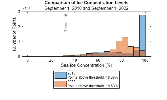
Compare Years Using Histograms
Quantitatively visualize the data using histograms. Compare the data for two years by displaying two histograms in the same figure. Avoid analyzing ice concentrations below a specified level using a threshold.
Select two years to compare.
yr1 =2010; yr2 =
2022;
For each year, find the data band, read the data band, convert the concentrations to percentages, and get the reference time.
bandYr1 = find(yrs == yr1);
bandYr2 = find(yrs == yr2);

[iceConcentrationYr1,RYr1] = readgeoraster("seaice.grib",Bands=bandYr1);
[iceConcentrationYr2,RYr2] = readgeoraster("seaice.grib",Bands=bandYr2);

percentIceYr1 = 100*iceConcentrationYr1;
percentIceYr2 = 100*iceConcentrationYr2;

refTimeYr1 = string(refTime(bandYr1),"MMMM d, yyyy");
refTimeYr2 = string(refTime(bandYr2),"MMMM d, yyyy");
Select a threshold for the ice concentrations.
threshold =  30;
30;For each year, extract the data points that are above the threshold. Find the percentage of data points that are above the threshold, excluding the NaN values.
% yr1
idxAboveThresholdYr1 = percentIceYr1 > threshold;
aboveThresholdYr1 = percentIceYr1(idxAboveThresholdYr1);
percentAboveThresholdYr1 = 100*numel(aboveThresholdYr1)/sum(~isnan(percentIceYr1),"all");

% yr2
idxAboveThresholdYr2 = percentIceYr2 > threshold;
aboveThresholdYr2 = percentIceYr2(idxAboveThresholdYr2);
percentAboveThresholdYr2 = 100*numel(aboveThresholdYr2)/sum(~isnan(percentIceYr2),"all");
Display the ice concentrations using two histograms. Specify the bin edges using the levels. Display the threshold using a vertical line.
figure
histogram(aboveThresholdYr1,levels,FaceAlpha=0.5)
hold on
histogram(aboveThresholdYr2,levels,FaceAlpha=0.5)
xline(threshold,"-",{'Threshold '},HandleVisibility="off")
Display the year and the percentage of data points that are above the threshold in a legend.
labely1 = sprintf("%d \nPoints above threshold: %.2f%%",yr1,percentAboveThresholdYr1);
labely2 = sprintf("%d \nPoints above threshold: %.2f%%",yr2,percentAboveThresholdYr2);
legend(labely1,labely2,Location="southoutside")
Add titles and labels.
title("Comparison of Ice Concentration Levels")
subtitle(refTimeYr1 + " and " + refTimeYr2)
xlabel("Sea Ice Concentration (%)")
ylabel("Number of Points")
When data is stored as a grid of rectangular cells referenced to geographic coordinates, you can find the surface area by using the areamat function. However, most GRIB data is stored as grids of posting point samples. For more information about the difference between cells and posting points, see Reference Raster Data Using Geographic or World Limits.
References
[1] Hersbach, H., B. Bell, P. Berrisford, G. Biavati, A. Horányi, J. Muñoz Sabater, J. Nicolas, et al. "ERA5 Hourly Data on Single Levels from 1940 to Present." Copernicus Climate Change Service (C3S) Climate Data Store (CDS), 2023. Accessed May 22, 2023. https://doi.org/10.24381/cds.adbb2d47.
[2] Neither the European Commission nor ECMWF is responsible for any use that may be made of the Copernicus information or data it contains.
Helper Functions
The setupArcticMapAxes function sets up a map axes object for an arctic region using the colormap cmapIn and the ice concentration levels levelsIn. Within the function:
Create a map axes object that uses a projected coordinate reference system (CRS) appropriate for an arctic region. Use the WGS 84 / Arctic Polar Stereographic projected CRS, which has the EPSG code
3995. Apply a cartographic map layout.Set the colormap. Set the color limits using the minimum and maximum values of the ice concentration levels.
Add a labeled color bar. Specify the ticks using the ice concentration levels.
Set the hold state of the axes object to
on.
function setUpArcticMapAxes(cmapIn,levelsIn)
    % create map axes object
    pcrs = projcrs(3995);
    mapaxes(ProjectedCRS=pcrs,MapLayout="cartographic");

    % set colormap and color limits
    colormap(cmapIn)
    clim([min(levelsIn) max(levelsIn)])

    % add labeled color bar
    cb = colorbar;
    cb.Ticks = levelsIn;
    cb.Label.String = "Sea Ice Concentration (%)";

    % set hold state to on
    hold on
end
The writeAnimatedGIF function writes the figure figIn to the animated GIF with name filename. Within the function:
Extract the color data from the figure. Convert the RGB image to an indexed image. Preserve the spatial resolution by turning off dithering.
Write the image to the GIF. If the GIF does not exist, create a new GIF using the image. If the GIF does exist, append the image to the GIF.
function writeAnimatedGIF(figIn,filename)
    % create indexed image from figure
    data = getframe(figIn);
    RGB = data.cdata;
    [figFrame,figCmap] = rgb2ind(RGB,256,"nodither");

    % write image to GIF
    if ~exist(filename,"file")
        imwrite(figFrame,figCmap,filename,"gif",Loopcount=Inf,DelayTime=0.5)
    else
        imwrite(figFrame,figCmap,filename,"gif",WriteMode="append",DelayTime=0.5)
    end
end
See Also
Functions
Objects
RasterInfo|projcrs|MapAxes