boxplot
Visualize summary statistics with box plot
Description
boxplot( creates a box plot of the
data in x)x. If x is a vector,
boxplot plots one box. If x is a
matrix, boxplot plots one box for each column of
x.
On each box, the
central mark indicates the median, and the bottom and top edges of the box indicate the 25th and
75th percentiles, respectively. The whiskers extend to the most extreme data points not
considered outliers, and the outliers are plotted individually using the '+'
marker symbol.
boxplot( creates
a box plot using the axes specified by the axes graphic object
ax,___)ax, using any of the previous syntaxes.
boxplot(___,
creates a box plot with additional options specified by one or more
Name,Value)Name,Value pair arguments. For example, you can specify
the box style or order.
Examples
Load the sample data.
load carsmallCreate a box plot of the miles per gallon (MPG) measurements. Add a title and label the axes.
boxplot(MPG)
xlabel('All Vehicles')
ylabel('Miles per Gallon (MPG)')
title('Miles per Gallon for All Vehicles')
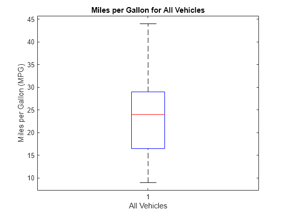
The box plot shows that the median miles per gallon for all vehicles in the sample data is approximately 24. The minimum value is about 9, and the maximum value is about 44.
Load the sample data.
load carsmallCreate a box plot of the miles per gallon (MPG) measurements from the sample data, grouped by the vehicles' country of origin (Origin). Add a title and label the axes.
boxplot(MPG,Origin)
title('Miles per Gallon by Vehicle Origin')
xlabel('Country of Origin')
ylabel('Miles per Gallon (MPG)')
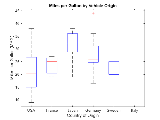
Each box visually represents the MPG data for cars from the specified country. Italy's "box" appears as a single line because the sample data contains only one observation for this group.
Generate two sets of sample data. The first sample, x1, contains random numbers generated from a normal distribution with mu = 5 and sigma = 1. The second sample, x2, contains random numbers generated from a normal distribution with mu = 6 and sigma = 1.
rng default  % For reproducibility
x1 = normrnd(5,1,100,1);
x2 = normrnd(6,1,100,1);
Create notched box plots of x1 and x2. Label each box with its corresponding mu value.
figure
boxplot([x1,x2],'Notch','on','Labels',{'mu = 5','mu = 6'})
title('Compare Random Data from Different Distributions')
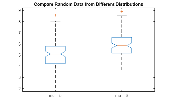
The box plot shows that the difference between the medians of the two groups is approximately 1. Since the notches in the box plot do not overlap, you can conclude, with 95% confidence, that the true medians do differ.
The following figure shows the box plot for the same data with the maximum whisker length specified as 1.0 times the interquartile range. Data points beyond the whiskers are displayed using +.
figure
boxplot([x1,x2],'Notch','on','Labels',{'mu = 5','mu = 6'},'Whisker',1)
title('Compare Random Data from Different Distributions')
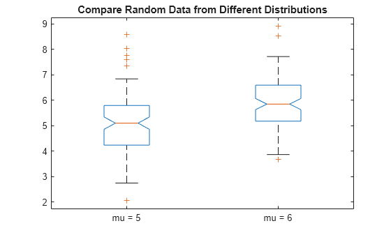
With the smaller whiskers, boxplot displays more data points as outliers.
Create a 100-by-25 matrix of random numbers generated from a standard normal distribution to use as sample data.
rng default  % For reproducibility
x = randn(100,25);
Create two box plots for the data in x on the same figure. Use the default formatting for the top plot, and compact formatting for the bottom plot.
figure

subplot(2,1,1)
boxplot(x)

subplot(2,1,2)
boxplot(x,'PlotStyle','compact')
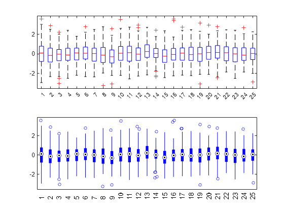
Each plot presents the same data, but the compact formatting may improve readability for plots with many boxes.
Create box plots using grouped data. Change the order of the box plots by specifying the order of the data groups.
Load the carsmall data set, which contains measurements for 100 cars.
load carsmallCreate box plots of the miles per gallon (MPG) values. Group the data based on the country of origin and model year of the cars. Orient the box plots horizontally so that the group labels are more visible.
groupingVariables = {Origin,Model_Year};
boxplot(MPG,groupingVariables,"Orientation","horizontal")
xlabel("MPG")
title("MPG by Origin and Year")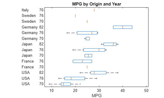
The carsmall data set does not contain a car for every combination of origin and model year. For example, the data set does not contain a car made in Italy in 1970.
Reorder the box plots by using the GroupOrder name-value argument. Specify the order of each group in the data set. Use commas to separate the values from different grouping variables.
groupOrder = ["USA,82","USA,76","USA,70","Sweden,76","Sweden,70", ...
    "Japan,82","Japan,76","Japan,70","Italy,76","Germany,82", ...
    "Germany,76","Germany,70","France,76","France,70"];
boxplot(MPG,groupingVariables,"Orientation","horizontal", ...
    "GroupOrder",groupOrder)
xlabel("MPG")
title("MPG by Origin and Year")
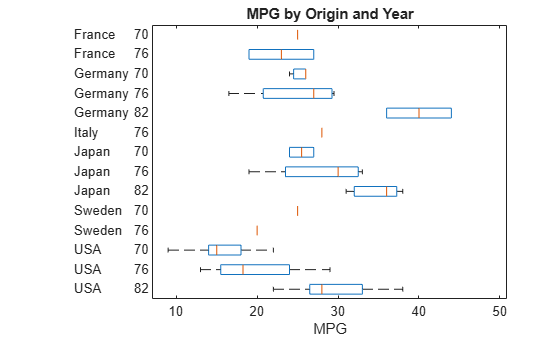
The countries of origin are now in alphabetical order from top to bottom, and the model years for each country are in ascending order from top to bottom.
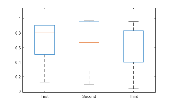
Create box plots for data vectors of varying length by using a grouping variable.
Randomly generate three column vectors of varying length: one of length 5, one of length 10, and one of length 15. Combine the data into a single column vector of length 30.
rng('default')  % For reproducibility
x1 = rand(5,1);
x2 = rand(10,1);
x3 = rand(15,1);
x = [x1; x2; x3];
Create a grouping variable that assigns the same value to rows that correspond to the same vector in x. For example, the first five rows of g have the same value, First, because the first five rows of x all come from the same vector, x1.
g1 = repmat({'First'},5,1);
g2 = repmat({'Second'},10,1);
g3 = repmat({'Third'},15,1);
g = [g1; g2; g3];
Create the box plots.
boxplot(x,g)
Input Arguments
Name-Value Arguments
Specify optional pairs of arguments as
Name1=Value1,...,NameN=ValueN, where Name is
the argument name and Value is the corresponding value.
Name-value arguments must appear after other arguments, but the order of the
pairs does not matter.
Before R2021a, use commas to separate each name and value, and enclose
Name in quotes.
Example: 'Notch','on','Labels',{'mu = 5','mu = 6'} creates a
notched box plot and labels the two boxes mu = 5 and mu
= 6, from left to right
Box Appearance
Box style, specified as one of the following.
| Name | Value |
|---|---|
'outline' | Plot boxes using an unfilled box with dashed
whiskers. This is the default if
'PlotStyle' is
'traditional'. |
'filled' | Plot boxes using a narrow filled box with lines for
whiskers. This is the default if
'PlotStyle' is
'compact'. |
Example: 'BoxStyle','filled'
Box colors, specified as an RGB triplet, character vector, or string scalar. An RGB triplet is a three-element row vector whose elements specify the intensities of the red, green, and blue components of the color, respectively. Each intensity must be in the range [0,1].
The following table lists the available color characters and their equivalent RGB triplet values.
| Long Name | Short Name | RGB Triplet |
|---|---|---|
| Yellow | 'y' | [1 1 0] |
| Magenta | 'm' | [1 0 1] |
| Cyan | 'c' | [0 1 1] |
| Red | 'r' | [1 0 0] |
| Green | 'g' | [0 1 0] |
| Blue | 'b' | [0 0 1] |
| White | 'w' | [1 1 1] |
| Black | 'k' | [0 0 0] |
You can specify multiple colors either as a character vector or string
scalar of color names (for example, 'rgbm') or a
three-column matrix of RGB values. The sequence is replicated or
truncated as required, so for example, 'rb' gives
boxes that alternate red and blue.
If you do not specify the name-value pair
'ColorGroup', then boxplot
uses the same color scheme for all boxes.
Example: 'Colors','rgbm'
Median style, specified as one of the following.
| Name | Value |
|---|---|
'line' | Draw a line to represent the median in each box. This
is the default when 'PlotStyle' is
'traditional'. |
'target' | Draw a black dot inside a white circle to represent
the median in each box. This is the default when
'PlotStyle' is
'compact'. |
Example: 'MedianStyle','target'
Marker for comparison intervals, specified as one of the following.
| Name | Value |
|---|---|
'off' | Omit comparison intervals from box display. |
'on' | If 'PlotStyle' is
'traditional', draw comparison
intervals using notches. If
'PlotStyle' is
'compact', draw comparison
intervals using triangular markers. |
'marker' | Draw comparison intervals using triangular markers. |
Two medians are significantly different at the 5% significance level
if their intervals do not overlap. boxplot
represents interval endpoints using the extremes of the notches or the
centers of the triangular markers. The notch extremes correspond to q2 –
1.57(q3 –
q1)/sqrt(n) and q2 +
1.57(q3 –
q1)/sqrt(n), where q2 is the median (50th percentile), q1 and q3 are the 25th and 75th percentiles, respectively, and
n is the number of observations without any
NaN values. If the sample size is small, the
notches might extend beyond the end of the box.
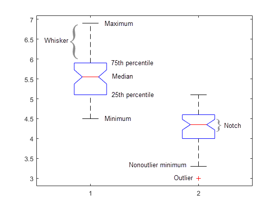
For a labeled example of box plots with notches, see Box Plot.
Example: 'Notch','on'
Marker size for outliers, specified as a positive numeric value. The specified value represents the marker size in points.
If 'PlotStyle' is 'traditional',
then the default value for OutlierSize is 6. If
'PlotStyle' is 'compact', then
the default value for OutlierSize is 4.
Example: 'OutlierSize',8
Data Types: single | double
Plot style, specified as one of the following.
| Name | Value |
|---|---|
'traditional' | Plot boxes using a traditional box style. |
'compact' | Plot boxes using a smaller box style designed for plots with many groups. This style changes the defaults for some other parameters. |
Example: 'PlotStyle','compact'
Marker and color for outliers, specified as a character vector or string scalar containing symbols for the marker and color. The symbols can appear in any order. If you omit the marker symbol, then outliers are invisible. If you omit the color symbol, then outliers appear in the same color as the box.
If 'PlotStyle' is 'traditional',
then the default value is '+r', which plots each
outlier using a red plus sign '+' marker
symbol.
If 'PlotStyle' is 'compact',
then the default value is 'o', which plots each
outlier using a circle 'o' marker symbol in the same
color as the corresponding box.
| Marker | Description | Resulting Marker |
|---|---|---|
"o" | Circle |
|
"+" | Plus sign |
|
"*" | Asterisk |
|
"." | Point |
|
"x" | Cross |
|
"_" | Horizontal line |
|
"|" | Vertical line |
|
"square" | Square |
|
"diamond" | Diamond |
|
"^" | Upward-pointing triangle |
|
"v" | Downward-pointing triangle |
|
">" | Right-pointing triangle |
|
"<" | Left-pointing triangle |
|
"pentagram" | Pentagram |
|
"hexagram" | Hexagram |
|
| Color | Description |
|---|---|
| Yellow |
| Magenta |
| Cyan |
| Red |
| Green |
| Blue |
| White |
| Black |
Example: Specify 'Symbol','' to make the outliers
invisible.
Box width, specified as a numeric scalar or numeric vector. If the number of boxes is not equal to the number of width values specified, then the list of values is replicated or truncated as necessary.
This name-value pair argument does not alter the spacing between
boxes. Therefore, if you specify a large value for
'Widths', the boxes might overlap.
The default box width is equal to half of the minimum separation
between boxes, which is 0.5 when the 'Positions'
name-value pair argument takes its default value.
Example: 'Widths',0.3
Data Types: single | double
Group Appearance
Data Limits and Maximum Distances
Plot Appearance
More About
A box plot provides a visualization of summary statistics for sample data and contains the following features:
The bottom and top of each box are the 25th and 75th percentiles of the sample, respectively. The distance between the bottom and top of each box is the interquartile range.
The red line in the middle of each box is the sample median. If the median is not centered in the box, the plot shows sample skewness.
The whiskers are lines extending above and below each box. Whiskers go from the end of the interquartile range to the furthest observation within the whisker length (the adjacent value).
Observations beyond the whisker length are marked as outliers. By default, an outlier is a value that is more than 1.5 times the interquartile range away from the bottom or top of the box. However, you can adjust this value by using additional input arguments. An outlier appears as a red + sign.
Notches display the variability of the median between samples. The width of a notch is computed so that boxes whose notches do not overlap have different medians at the 5% significance level. The significance level is based on a normal distribution assumption, but comparisons of medians are reasonably robust for other distributions. Comparing box plot medians is like a visual hypothesis test, analogous to the t test used for means. In some cases, notches can extend outside the boxes.
Tips
boxplotcreates a visual representation of the data, but does not return numeric values. To calculate the relevant summary statistics for the sample data, use the following functions:min— Find the minimum value in the sample data.max— Find the maximum value in the sample data.median— Find the median value in the sample data.quantile— Find the quantile values in the sample data. For example, to compute the 25th and 75th percentiles ofx, specifyquantile(x,[0.25 0.75]).iqr— Find the interquartile range in the sample data.grpstats— Calculate summary statistics for the sample data, organized by group.
You can see data values and group names using the data cursor in the figure window. The cursor shows the original values of any points affected by the
datalimparameter. You can label the group to which an outlier belongs using thegnamefunction.To modify graphics properties of a box plot component, use
findobjwith theTagproperty to find the component's handle.Tagvalues for box plot components depend on parameter settings, and are listed in the following table.Parameter Settings Tag Values All settings 'Box''Outliers'
When 'PlotStyle'is'traditional''Median''Upper Whisker''Lower Whisker''Upper Adjacent Value''Lower Adjacent Value'
When 'PlotStyle'is'compact''Whisker''MedianOuter''MedianInner'
When 'Notch'is'marker''NotchLo''NotchHi'
Alternative Functionality
You can also create a BoxChart object by using the boxchart
function. Although boxchart does not include all the functionality
of boxplot, it has some advantages. Unlike
boxplot, the boxchart function:
Allows for categorical rulers along the group axis
Provides the option of a legend
Works well with the
hold oncommandHas an improved visual design that helps you see notches more easily
To control the appearance and behavior of the object, change the BoxChart Properties.
References
[1] McGill, R., J. W. Tukey, and W. A. Larsen. “Variations of Boxplots.” The American Statistician. Vol. 32, No. 1, 1978, pp. 12–16.
[2] Velleman, P.F., and D.C. Hoaglin. Applications, Basics, and Computing of Exploratory Data Analysis. Pacific Grove, CA: Duxbury Press, 1981.
[3] Nelson, L. S. “Evaluating Overlapping Confidence Intervals.” Journal of Quality Technology. Vol. 21, 1989, pp. 140–141.
[4] Langford, E. “Quartiles in Elementary Statistics”, Journal of Statistics Education. Vol. 14, No. 3, 2006.
Version History
Introduced before R2006aSee Also
anova1 | kruskalwallis | multcompare | min | max | median | quantile | iqr | grpstats