Confusing/cluttered website
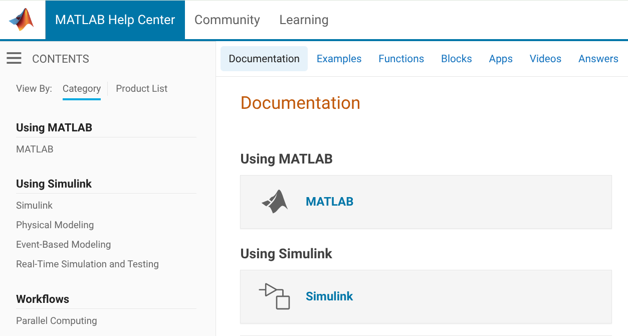
This website is not very attractive or easy to navigate. It is difficult to even find this section - if you start at the Mathworks website, there is no community tab:

You have to go to Help Center, which takes you to documentation, and then click on Community (redirecting you from https://www.mathworks.com/help to https://www.mathworks.com/matlabcentral)
Once you get there it's still a mess
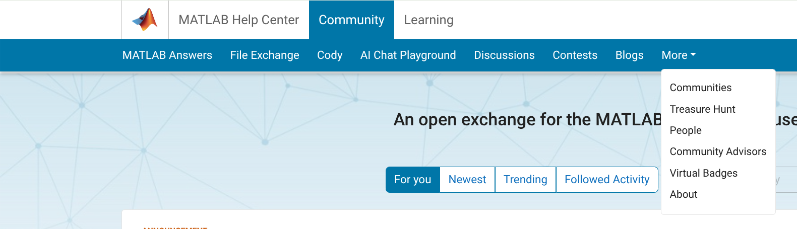
If I have a question, it's not clear whether I should go to MATLAB Answers, Discussions, or Communities. It's not clear what the People page is for, or why it's split off from Community Advisors and Virtual Badges. "Cody" isn't very self-explanatory, and people will only stumble on it by accident, this seems like it should be integrated with contests. Don't get me started on the mess of a Blogs page. My browser knows that I speak English, so why am I being served Japanese language blogs?
I know that web design isn't the main priority of Mathworks, but the website has a very early-2010's look that increasingly feels dated. I hope there will be more consideration given to web UI/UX in the future.
2 Comments
Time DescendingHi JH,
Thank you for your candor, and also for sharing such detailed feedback. I provide UX support for the MathWorks website and agree there are a lot of opportunities to make things better. I’m actively working with our team to address issues around navigation, clarity, and overall user experience.
If you’re open to it, I’d love to set up a conversation to learn more about your perspective. You can direct message me here by clicking my name, then then the little envelope icon on the card that pops up. And no, the irony of explaining how to do this is not lost on me :-)
Thanks again for sharing this with us.
Hi JH,
Thank you for taking the time to explore the site navigation and share your feedback with us. Navigation is indeed a top priority in our website design, though it can be complex. We currently have projects underway to address some of the pain points you mentioned. For example, we are working to make it easier for community users to ask technical questions, start discussions, or submit code files.
We encourage you to continue exploring different areas of the community and to share any additional feedback you may have. Your input is invaluable to us as we work to improve the site experience.
Thank you again for your insights!
Sign in to participate