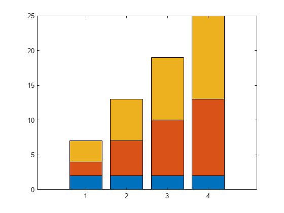
Stacked bar chart for local sensitivity analysis
Hi All,
I'm trying to produce some nice figures from the graphical user interface and have a set of local sensitivity analyses that I'd like to combine.
I have two inputs that vary the sensitivies of my system and would like to plot them on top of each other like:
Is there either a way to do this natively in simbiology (when you try and use 'keep results from each run' it plots them both as a time series) or to export the sensitivity data to the normal matlab programatic UI where I can combine them by hand?
Thank you for your help!
3 Comments
Time DescendingHi, Daniel,
SimBiology does not have a way to create the exact plot you want from within the app, but it is pretty straightforward to create the plot from the MATLAB command line - the sensitivity value plotted for a given input x and output y is just the integral over time of the absolute value of d[y]/d[x].
You can export program results from the app by going to the Browser panel in the left-hand side of the Model Analyzer, right-clicking on the data you want to export and selecting “Export Data to MATLAB Workspace....”
From there you can use the getsensmatrix function to extract the local sensitivity values over time, and then use trapz to compute the integral. You can find an example in the documentation here:
Once you have the integrated sensitivities, you can plot them as you need, such as the stacked bar plot.
Hope this helps,
Priya
Hi Priya,
Perfect, thank you. I'd gotten most of the way manually but getsensmatrix solved my issue with getting the parameter names easily. Thank you again!
I've found out how to export the data to my MATLAB workspace so I'll start working on it by hand, but if there's an easy solution I'd love to hear it! Thanks.
Sign in to participate